Web development

AgencyKit · SaaS Product Website

A subscription SaaS product whose purchase decision is made through search and comparison rather than a sales call. The site was built as a complete acquisition engine: Feature pages, comparisons, free tools and a content library, each catching a different search intent and each ending at the same free trial.

16

product capabilities, each with a page that gets found on its own

Client
AgencyKit
Industry
SaaS software, business management for agencies and freelancers

agencykit.techOpen the site

agencykit.tech/

In short

01

The challenge

  • The product sells at $9 a month. There is no sales call and no quote. The site has to close the decision on its own.
  • Fifteen distinct capabilities in one product: proposals, contracts, invoices, payments, time tracking, tasks, meetings, reports, each with an audience searching for it on its own.
  • The buyer compares against established global products before trying anything, and that comparison happens on Google rather than on the site.
02

What we did

  • A page of its own for each of the fifteen capabilities and each of the six kinds of customer, so every search intent finds its page.
  • Ten direct comparison pages against the competing products, so the comparison happens on the site rather than in somebody else's article.
  • Nine free tools running in the browser with no signup, giving value before asking for anything.
03

What came of it

  • The site now works as an acquisition engine: it catches the person searching for a capability, the person searching for an alternative to a competing product, and the person searching for a free tool, and all three end at the same free trial.
  • Pricing and the plan comparison are readable on the page without signing up, so the decision is made before anybody enters their details.
  • The product is declared to language models with SoftwareApplication data carrying its price and a structured FAQ, plus a dedicated page explaining the product to models.

Project snapshot

How big a job this was

Large. Six layers with entirely different jobs: 16 feature pages, 6 customer-type pages, 10 comparison pages, 9 interactive tools that genuinely compute, 5 guides, and an article library and glossary that keep growing. This is not a product site. It is an acquisition system.

Project size
Large
Type of site
A SaaS product site with a full acquisition layer
Who it speaks to
Freelancers and owners of small and mid-sized agencies looking for an alternative to a stack of per-seat tools. They compare against global products like HoneyBook, Dubsado and Bonsai before they ever start a trial.
Built on
Next.js · Caddy
  • 16

    capabilities with a page of their own

    From proposals and contracts to reports, white-label and the AI assistant

  • 10

    head-to-head comparison pages

    HoneyBook, Dubsado, Bonsai, Moxie, 17hats, Notion, ClickUp, Asana, Clockify, Trello

  • 9

    free tools running in the browser

    An invoice generator, a rate calculator, a utilisation calculator, an LTV/CAC calculator and others

  • 6

    kinds of customer with a page each

    Marketing agencies, freelancers, design studios, web agencies, social media managers, consultants

Scope delivered

  • Product positioning and messaging
  • Information architecture for 15 capabilities and six audiences
  • UX and the free-trial journey
  • Interface design and a product visual system
  • A Next.js build across six layers of pages
  • Interactive tools running in the browser
  • Technical SEO foundations and product structured data
  • Content: articles, guides and a glossary

Technologies

  • Next.jsThe whole site, with pages rendered on the server
  • ReactThe interactive tools and calculators
  • CaddyWeb server and certificates
  • Schema.org JSON-LDSoftwareApplication with its price, an FAQ, a video and the organisation
  • hreflangUS and UK English versions with an x-default

The client

Whose site this is

AgencyKit brings the whole of an agency's or a freelancer's client work into one place: the proposal, the contract and its e-signature, the invoice, online payment, time tracking, tasks, meetings, a leads pipeline, a client portal, email broadcasts, reports and P&L, roles and permissions, white-label branding, and an AI assistant driven from Claude and Cursor through MCP.

The commercial idea underneath it is simple and stated plainly: pricing is per account, not per user. Plans are $9, $39 and $69 a month, and adding a second or third teammate does not multiply the bill. That is the substantive difference from the per-seat products it competes with.

A $9-a-month product is not sold on a call. The call costs more than the subscription earns in its first months, so the site is not a marketing channel sitting beside a sales team. It is the sales team.

Which means every question the buyer might ask has to be answered on the site: what exactly it does, what it replaces, what it costs, how it differs from the tool they use today, and whether they can try it before paying. A question with no page becomes hesitation, and hesitation on a monthly subscription means a closed tab.

Where it started

What the site was stalling on

The challenge here is not that the product is complicated. It is that the product is broad, and breadth works against you in search.

AgencyKit does fifteen different things. A site that says all-in-one platform to run your business loses all fifteen, because nobody searches that phrase. People search for the one specific thing they need today: proposal software, online contract signing, tracking billable hours for invoicing. Each of those is a different person with a different problem, and all of them end up needing the same product.

Beneath that sits a harder layer: this buyer is not starting from nothing. They are almost certainly using something already (HoneyBook, Dubsado, Notion, or a spreadsheet) and their real question is not what is this, but why is this better than what I have. That comparison happens on Google, and it ends in an article on somebody else's site or a listing on a review platform: entirely outside your control.

And a third layer: $9 a month creates a paradox. The price is low enough to make the decision easy, and low enough that there is no margin for a sales call or a personal demo. The site has to do all of the work alone, and do it for every one of those fifteen entrances.

  • A product with fifteen capabilities, each with an audience searching for it on its own.
  • No sales call. A $9 price does not fund one.
  • The buyer compares against established global products before trying anything.
  • That comparison happens on Google, off the site and out of your hands.
  • Six different kinds of customer (a marketing agency, a freelancer, a design studio) using the same product in different ways.
  • An international audience invoicing in several currencies, so the price has to read correctly from anywhere.

The brief

What the new site had to do

  • Every one of the fifteen capabilities findable on its own page in search.
  • The comparison against competitors happening on the site itself rather than in somebody else's article.
  • A visitor getting real value before being asked for any details.
  • Pricing fully readable without signing up, with the difference between plans plain.
  • A visitor able to understand the product in nine minutes if they want to see it working.
  • The product read correctly by language models, because part of the searching now happens there.

Strategy

How the problem was approached

The strategy turned the breadth from a liability into the asset.

The product does fifteen things. Instead of that being one general sentence on a home page, it became fifteen independent entrances. Each capability got its page: proposals, contracts and e-signature, invoices and payments, time tracking, tasks, retainers, meetings, leads, clients, the client portal, email broadcasts, reports, team and permissions, white-label, and the AI assistant.

On top of that sits a second layer dividing by audience rather than by capability: marketing agencies, freelancers, design studios, web agencies, social media managers and consultants. The same product, explained in each one's language and around what each one cares about.

The third layer settles the comparison: ten pages putting AgencyKit head to head with each named competitor. That decision matters more than it looks. The comparison will happen regardless, and the only question is where. When it happens on your own site, you set its frame.

The fourth layer works entirely ahead of intent: nine free tools that genuinely compute, an article library and a glossary.

A capability as an entrance

A broad product gets found through its parts, not as a whole. Somebody who needs online contract signing searches for online contract signing, not for a business management platform. So fifteen capabilities became fifteen independent pages, each explaining its capability as though it were the product, and only then revealing the whole platform behind it. That order is deliberate: the capability brings the visitor, the platform convinces them.

The comparison on your own ground

Ten head-to-head pages against HoneyBook, Dubsado, Bonsai, Moxie, 17hats, Notion, ClickUp, Asana, Clockify and Trello. That comparison happens whether you write it or not; the difference is that in somebody else's article, the frame is theirs and so is the conclusion. The argument has to be honest to work: the page says where this product fits and where the competitor fits better, which is what makes a reader believe the rest of it.

Value before the ask

Nine free tools running entirely in the browser with no signup and no email: an invoice generator that downloads a PDF, an hourly rate calculator, a utilisation calculator, a billable-hours calculator, a blended-rate calculator, a capacity calculator, and an LTV-against-CAC calculator. Requiring no signup is the decision: a tool that demands an email before it works is not a tool, it is a form. And somebody using an agency rate calculator is precisely the person who needs the product.

Pricing as an argument, not a table

The product's central commercial advantage (per account, not per seat) was put where it belongs: at the heart of the argument rather than inside a pricing page. Add your second or third teammate without the bill multiplying is a sentence that works because it compares itself to the alternative implicitly. All three plans are shown in full with their features on the home page, and the trial is 14 days with no card, every source of hesitation removed from the path.

Presence to the language models

A growing share of software research now happens at a language model: what is the best alternative to HoneyBook? So the product was declared with SoftwareApplication data carrying its price and currency, a structured FAQ, a declared video, and a robots file that states plainly that search, reading and training are all permitted. There is also a dedicated page explaining the product to models directly.

Video in place of a demo

A fifteen-capability product is hard to convey in writing alone, and there is no budget for a personal demo per visitor. So a nine-minute tour was made, divided into chapters, following a real studio from first lead to paid invoice. The chapters matter: somebody who only cares about invoicing goes straight to that chapter.

Design

How it looks, and why each call was made

The visual language here has one job before any other: to make the product look like a product that exists rather than a landing page selling an idea.

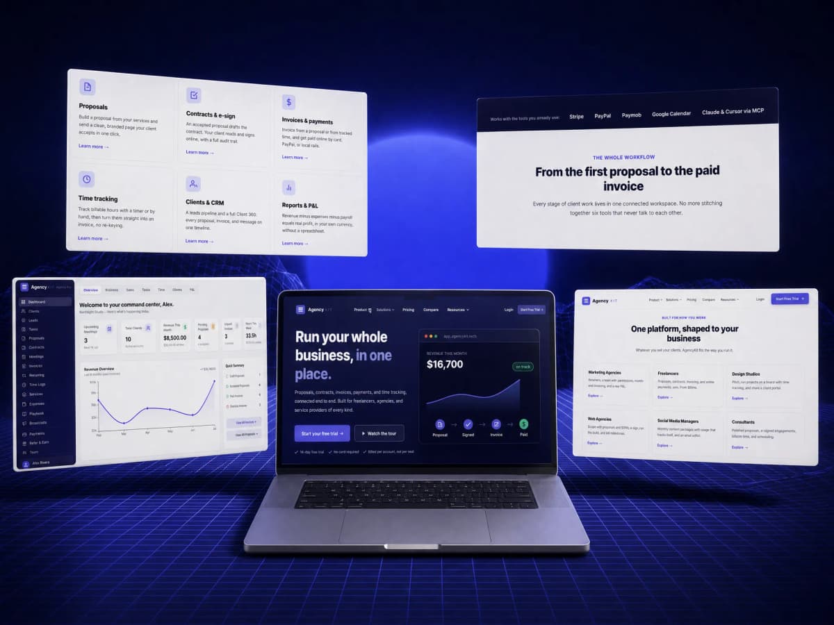
That was done with the smallest possible means: the home page carries no photographs at all. The interface shown on it is built in code. An application view assembled from real elements showing monthly revenue and the path from proposal to signature to invoice to payment. That gives two things at once: a very light page, and more credibility than any screenshot, because what you are looking at is made of the same material as the product rather than a picture of it.

The main navigation was designed as a map of the product rather than a list of links: every entry carries the capability's name with a line beneath saying what it does. Contracts and e-sign, signed online, with an audit trail. A visitor understands the whole product from the menu before opening a single page.

And the home page's sequence follows the order the questions arrive in: what does it do, what does it look like working, who is it for, why not the competitor, try something free right now, what does it cost, and what is still unanswered.

An interface built in code instead of screenshots

A screenshot goes stale on the first release, weighs the page down and reads as a picture. A built interface stays current and light, and conveys that the product actually exists.

A menu that explains rather than only links

For a fifteen-capability product, a menu of bare names gets closed. A line beneath each entry makes the menu itself the fastest explanation of the product.

All three plans in full on the home page

Hiding the price behind another page creates hesitation, and hesitation on a $9 subscription means the visitor does not come back. The price is visible so the decision can be made in the same session.

Free tools with no signup at all

A tool that asks for an email before it works is not a tool, it is a form. The value goes first, and the trust that buys is worth more than the address.

The pricing logic written as an argument, not a footnote

Per account, not per seat is the core commercial advantage. Written as small print under a table, it goes unnoticed and unused in the comparison.

The video tour divided into chapters

Nine minutes is a lot for somebody who only cares about invoicing. Chapters let the video work as a reference rather than a film that has to be watched from the start.

The build

How it was built

A site this size cannot be written page by page by hand, and if it were, it could not be maintained.

So the pages were built from record types: a capability is a type, a customer kind is a type, a comparison is a type, a tool is a type, an article is a type, a glossary term is a type. Each has its shape, its fields and its template, and the page is generated from the record. That is what makes ten comparison pages built on the same logic and judged against the same criteria, which is not internal housekeeping but the condition under which a reader can compare at all.

The whole site renders on the server, so its content arrives complete in the HTML. For a product drawing half its value from search, that is not a technical detail but a condition of existing.

The interactive tools were built as components running in the browser on top of pages that already exist, so the calculations happen on the visitor's own device and no data is sent anywhere. That is what makes the no-signup promise real rather than cosmetic.

  • Six record types: capability, audience, comparison, tool, article, glossary term, each with its template.
  • The tools compute in the browser, so no data is sent to a server.
  • SoftwareApplication data with its price and currency, an FAQPage, and a VideoObject for the tour.
  • hreflang for US and UK English versions with an x-default.
  • A dedicated page explaining the product to language models, and a robots file explicitly permitting search, reading and training.
  • Integrations named openly: Stripe, PayPal, Paymob, Google Calendar, and Claude and Cursor through MCP.

Features

What the site can do

16 independent capability pages

Every capability with its own page and URL, explaining itself as though it were the product and then revealing the platform behind it.

10 comparison pages against named competitors

HoneyBook, Dubsado, Bonsai, Moxie, 17hats, Notion, ClickUp, Asana, Clockify, Trello. The comparison happens here rather than in somebody else's article.

9 free tools that work with no signup

An invoice generator that downloads a PDF in any currency, and calculators for hourly rate, utilisation, capacity and LTV against CAC.

Six pages divided by kind of customer

Marketing agencies, freelancers, design studios, web agencies, social media managers and consultants. The same product in each one's language.

A nine-minute video tour with chapters

A real studio running from first lead to paid invoice, with chapters letting a visitor jump to the part that concerns them.

Full pricing and a plan comparison on the page

Three plans with their prices and features, and a detailed comparison table. All without signing up.

An article library and a glossary

Working the stage before purchase intent, and routing into the capability page each concerns.

A full declaration to language models

SoftwareApplication data with its price, a structured FAQ, and a dedicated page explaining the product to models.

Measurement

Figures you can check yourself, right now

Open the domain and run PageSpeed on it. These are the figures you should find.

  • 95

    Performance

    Lighthouse desktop: run against the published domain, 6 September 2026

  • 93

    Accessibility

    Lighthouse desktop: run against the published domain, 6 September 2026

  • 100

    Best Practices

    Lighthouse desktop: run against the published domain, 6 September 2026

  • 92

    SEO

    Lighthouse desktop: run against the published domain, 6 September 2026

Detail for anybody who wants to go deeper. These are Lighthouse figures against the published domain.

Performance 95 and Best Practices 100 on a site of six page layers and nine interactive tools, which comes from a design decision rather than from compression: there is not a single photograph on the home page. The interface shown there is built in code, so the page is only 67 KB and carries 1,251 words readable with JavaScript switched off.

Accessibility at 93 and SEO at 92 both leave a little room, and those are open items written as they stand.

And the robots file carries an explicit line: search allowed, reading by language models allowed, training allowed. That is deliberately the opposite of the call made on the medical sites. A clinic loses if its content is trained on; a SaaS product gains when models know it and recommend it.

Search

What was set up for Google to read

Search here happens on three different levels, and each has its own layer of pages.

First: search by capability, proposal software, online contract signing. That goes to the feature pages.

Second: search by alternative, HoneyBook alternative, Dubsado vs Bonsai. That goes to the comparison pages, and it carries the highest purchase intent of the three, because somebody searching that way has already decided to switch.

Third: search by problem, how do I calculate my hourly rate, what is a retainer. That goes to the tools, the glossary and the articles: the widest layer and the furthest from a purchase, feeding the two above it.

  • A page and its own URL for each of the 16 capabilities and each of the six audiences.
  • Ten comparison pages catching alternative-to searches, the highest purchase intent there is.
  • SoftwareApplication data with price and currency, so the product is understood as a product rather than a page.
  • A structured FAQPage, a VideoObject for the tour, and Organization and WebSite declarations.
  • hreflang for US and UK English versions with an x-default.
  • A written title and description on every page, with a canonical declared.
  • A published sitemap carrying every page, with robots closing only the admin and the API.
  • An explicit policy for language models: search, reading and training all permitted.
  • A dedicated page explaining the product to language models directly.

01·From the build

What was actually built

This site is six layers with entirely different jobs.

The product layer, 16 pages, one per capability: proposals, contracts and e-signature, invoices and payments, time tracking, tasks, retainers, meetings, leads and pipeline, clients, the client portal, email broadcasts, reports and P&L, team and permissions, white-label, and the AI assistant.

The audience layer, 6 pages dividing by kind of customer rather than by capability: marketing agencies, freelancers, design studios, web agencies, social media managers and consultants.

The comparison layer, 10 pages putting the product head to head against named competitors.

The tools layer, 9 tools running in the browser: an invoice generator, a proposal generator, a pricing calculator, a utilisation calculator, a blended-rate calculator, a billable-hours calculator, an effective-hourly-rate calculator, an agency capacity calculator, and an LTV-against-CAC calculator.

The content layer. An article library, a glossary, and 5 long guides on agency profitability, getting paid, retainers, proposals and scope, and client management.

The operating layer, pricing, the full comparison table, the video tour, a security page, a changelog, partners, demo booking, and the legal pages.
02·From the build

Breadth is a liability in search until you take it apart

This product does fifteen things, which is an excellent sales argument and a disaster in search.

The reason is that nobody searches for an all-in-one platform to run your business. People search for the single thing in front of them right now: proposal software, sign a contract online, calculate billable hours. A site that answers with one general sentence loses all fifteen searches together, because it matches none of them.

So the breadth was taken apart. Each capability got a page explaining it as though it were the product, and once the visitor understands the thing they came for, the page shows them the full platform behind it. That order is the whole idea: the capability brings them, the platform convinces them. Reversed (a page that opens with the platform) and a visitor who came looking for contract signing feels they are in the wrong place.

On top of that sits a second division, by audience: a marketing agency cares about retainers, a team and a P&L; a freelancer cares about the proposal, the contract, the invoice and getting paid, and nothing else. The same product, with a different thing said first.

03·From the build

Ten comparison pages, and why honesty in them is a requirement

This buyer does not start from nothing. They are using something already, and their real question is not what is this, but why is this better than what I have.

That comparison happens whether you write it or not. The only variable is where: on your site, in an article on somebody else's, or in a listing on a review platform. In the latter two, the frame of the comparison is not yours and neither is the conclusion.

So ten pages were built putting AgencyKit head to head with HoneyBook, Dubsado, Bonsai, Moxie, 17hats, Notion, ClickUp, Asana, Clockify and Trello.

And what makes a page like that work is not the force of the argument. It is its honesty. Nobody believes a comparison page claiming the product is better at everything, and nobody reads past the first paragraph. The page that says we fit here, and they fit better there is the one that wins, because a reader trusts a judgement they have seen concede something.

The second reason is that an on-site comparison catches the highest purchase intent there is: somebody typing HoneyBook alternative has already decided to switch and is only choosing.

04·From the build

Nine tools that work before anything is asked for

The layer furthest from a purchase is the widest layer in search. Somebody asking how do I work out my hourly rate is not shopping for software, and is precisely the person who needs it.

So nine tools were built that run entirely in the browser: an invoice generator that downloads a PDF in any currency, a proposal generator, and calculators for hourly rate, blended rate, billable hours, effective rate, utilisation, agency capacity, and LTV against CAC.

The decisive call is that they require no signup and no email at all. A tool that asks for an email before it works is not a tool. It is a form dressed as one, and the visitor recognises the difference instantly and leaves. Value given with nothing asked builds trust worth far more than an address.

And so that promise is real rather than cosmetic, the tools compute on the visitor's own device and send nothing to any server. That is not a technical detail. It is the difference between a promise and a claim.

Beside them sit a glossary, an article library and five long guides, working the same stage: somebody learning how to run their business, not yet shopping for a tool.

05·From the build

A site with no photographs, and why that was a decision

This site's home page carries no photographs at all. That is not what is supposed to happen on a product site, and the decision rests on three reasons at once.

The first is credibility. A screenshot reads as a picture of a thing rather than the thing. But an interface built in code (showing monthly revenue and the path from proposal to signature to invoice to payment) is made of the same material as the product, and conveys that the product exists rather than that an idea is being sold.

The second is maintenance. A screenshot goes stale on the first release, and updating it means re-shooting, cropping and uploading. A built interface changes in a line.

The third is weight. A 67 KB page carrying 1,251 words readable without JavaScript is very hard to reach if that page is full of high-resolution screenshots.

The same reduce-to-clarify logic governed the navigation: instead of a list of fifteen bare capability names, each entry carries a line saying what it does. Contracts and e-sign, signed online, with an audit trail. A visitor understands the whole product from the menu before opening a single page.

06·From the build

A $9 product has no margin for hesitation

There is a paradox in this product's pricing: it is cheap enough to make the decision easy, and precisely because it is cheap there is no margin for a sales call or a personal demo.

Which means every point of friction on the path becomes a total loss. A visitor who cannot find the price will not email to ask. They will close the tab. Somebody who does not understand the difference between plans will not phone. They will postpone, and postponement on a monthly subscription means they do not come back.

So every hesitation was deliberately taken off the path. Pricing is in full on the home page: nine, thirty-nine and sixty-nine dollars, with what each includes beneath it. A detailed feature-by-feature table is there for anybody who wants certainty. And the trial is fourteen days with no card, which removes the last psychological obstacle.

The questions that stall the decision are written as explicit questions: what does it replace? What does per-account pricing mean? Is there really a free trial? Do I need the top plan to start? Can I invoice international clients? Can I cancel anytime?

Note that the last three are anxiety questions rather than information questions, and answering those plainly is what closes the decision, not further explanation of the features.

The phases

How the work ran

Taking the product apart

Identifying the fifteen capabilities that each deserve a page, and the six audiences using the product differently.

Mapping the search

Dividing search intent into three levels (capability, alternative, problem) and assigning a layer of pages to each.

The commercial argument

Framing per account, not per seat as the central argument, and deciding that pricing appears in full on the home page.

Design

A visual system with no photographs, a menu that explains the product, and an application interface built in code.

Build

Six record types with their templates, and interactive tools computing in the browser.

Content

16 feature pages, 10 comparisons, 6 audience pages, 5 guides, an article library, a glossary.

The tour and its video

Recording a nine-minute chaptered tour of a real studio from first lead to paid invoice.

Launch and indexing watch

Launch, watching the pages index, and reviewing the free-trial route.

Handover

What became yours

  • Domain, hosting and source files in the client's name from day one
  • A control panel the content is edited from without a developer
  • A walkthrough for whoever takes the site over afterwards
  • A month of monitoring and fixes after launch

Outcome

The outcome

The site became a complete acquisition engine that runs without a sales call.

Somebody searching for one capability finds its page. Somebody searching for an alternative to the product they use finds a direct, honestly written comparison on our site rather than in somebody else's article. Somebody still far from a purchase finds a free tool that calculates something they need right now without registering, or an article or a glossary term that explains it. All three end at the same point: a 14-day trial with no card.

Pricing is fully readable before signing up, all three plans are compared on the page, and a nine-minute chaptered tour is there for anybody who wants to watch the product work before deciding. And the product is declared to language models with its price and its questions, so its name comes up when somebody asks for an alternative.

In one line: a SaaS product website with a full acquisition layer. A fifteen-capability product taken apart into six layers of pages, each catching a different search intent and each ending at the same door.

Delivery figures

  • 16

    product capabilities with a page of their own

    Counted in the published sitemap, 6 September 2026

  • 10

    head-to-head comparisons against a named competitor

    Counted in the published sitemap, 6 September 2026

  • 9

    free tools computing in the browser with no signup

    Counted in the published sitemap, 6 September 2026

  • 6

    kinds of customer. The same product in each one's language

    Counted in the published sitemap, 6 September 2026

Work like this starts with a call about where you actually are

If this is close to what you need, the Web development page carries the whole method: what you receive, and the number the work answers to.

Our clients

Companies that chose to work with us

Some of our clients, across sectors with nothing in common.

  • Bravo Agrochemicals
  • El Masrya Office Furniture
  • Tareek El Shifa Center
  • Dr Ghada Yousry
  • Interact Labs
  • rawa
  • Next Industry
  • Medixia.ai
  • Falcon Water Treatment Systems
  • Golden Blast
  • Happy Plastics
  • Smart Modern School
  • Rafiq Academy
  • IPS Sports Academy
  • Mo Valley
  • Hyalure
  • G-Tour
  • Préime
  • Rahal
  • Dausar
  • El Gamry