Web development

Rahal · E-commerce Store

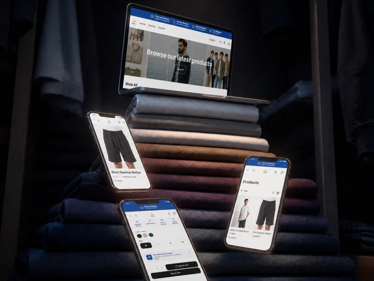
An Egyptian clothing brand selling online to a market that pays on delivery and asks on WhatsApp. The store was built around that buying behaviour rather than around an imported storefront template: cash on delivery, inspection before payment, 14-day returns, and a named courier, in complete Arabic and English versions.

2

complete versions, Arabic and English, each with its own URLs and sitemaps

Client
Rahal
Industry
Fashion and apparel, e-commerce

shoprahal.comOpen the site

shoprahal.com/

In short

01

The challenge

  • A new brand asking somebody to pay online to a name they do not know. That is the largest obstacle in Egyptian e-commerce, and it is a trust obstacle rather than a design one.
  • The Egyptian buyer asks before buying, and asks on WhatsApp rather than through a form.
  • The audience reads in Arabic and English, and the store has to work fully in both, products, pages and policies.
02

What we did

  • Cash on delivery and inspect before paying stated at the top of the page itself rather than buried in a policy page.
  • WhatsApp with a visible number and a promise of a fast reply, because that is the real question route in this market.
  • Two complete Arabic and English versions on separate URLs with separate sitemaps and hreflang declared between them with an x-default.
03

What came of it

  • A buyer sees the answer to their biggest objection, do I pay a brand I do not know, before they see the first product.
  • The courier is named with its delivery window and the return period is written out, so a buyer knows exactly what happens before ordering.
  • The store is declared to the shopping agents that buy on a user's behalf, with a UCP specification, an MCP endpoint and a dedicated discovery sitemap.

Project snapshot

How big a job this was

Small, and written here at its real size rather than an inflated one. The store is at the start of its life: two published products, two collections and seven static pages, across two complete language versions. The real work on this project is not in its page count; it is in what the store was built around: Egyptian buying behaviour, and being ready to grow without a rebuild.

Project size
Small
Type of site
A bilingual online store
Who it speaks to
Buyers in Egypt, mostly shopping from a phone, and hesitant to pay online to a brand they do not yet know. Some read in English, some in Arabic.
Built on
Shopify · Cloudflare
  • 2

    complete languages

    Arabic and English, each with its own URLs and its own sitemaps

  • 7

    static pages

    About, FAQ, contact, shipping, returns, privacy, terms

  • 14

    days to return, written as a promise rather than a condition

    No questions asked, stated at the top of the page

  • 4

    promises shown before the first product

    Cash on delivery, inspect before paying, 14-day returns and free shipping

Scope delivered

  • Store setup and catalogue structure
  • UX and the purchase journey
  • Design and storefront customisation
  • Setting up two complete language versions
  • Configuring shipping, cash on delivery and returns
  • Policy pages and the FAQ
  • Technical SEO foundations and structured data

Technologies

  • ShopifyThe store, the catalogue, the basket and checkout
  • CloudflareContent delivery and certificates
  • BostaShipping and delivery inside Egypt
  • Schema.org JSON-LDDeclaring the brand as an organisation
  • UCP / MCPDeclaring the store to the shopping agents that buy on a user's behalf

The client

Whose site this is

Rahal is an Egyptian clothing brand that introduces itself in one clear sentence: clothing made in Egypt for everyday life, with lasting comfort at honest prices.

The products published today are an oversized T-shirt and a short summer Melton coat, at 499 EGP each, across two collections. The brand sells online direct to the customer, and conversations happen on WhatsApp.

The store here is not a sales channel beside a shop. It is the shop. There is no branch to walk into and no rail to touch, so everything a real shop does (seeing the fabric, asking the assistant, taking it back if it does not fit) the site has to do by other means.

And that is exactly the problem a new brand faces in Egypt: the buyer is not hesitating about the product, they are hesitating about you. So the question the store was built to answer was not how do I show the product better, but how do I take the risk off somebody buying for the first time.

Where it started

What the site was stalling on

The problem in Egyptian e-commerce is neither technical nor a matter of design. It is a trust problem, and it has a specific shape.

The buyer sees the product, likes it, finds the price fair. Then they reach the payment step and stop. Not because the page is difficult, but because they are asking themselves an entirely reasonable question: who am I paying? If it does not arrive, or arrives different from the photograph, or the size is wrong, what then? And I had not heard of this brand yesterday.

That hesitation is not resolved by a better photograph or a clearer button. It is resolved by one thing: moving the risk off them and onto you.

Beside it sits a second layer: this buyer asks before buying. They want to know the size, the fabric, when it will arrive. A site answering with a leave your message and we will get back to you form loses them, because that is not the rhythm they are used to. They ask on WhatsApp and expect an answer in minutes rather than in a business day.

And a third layer: the audience is split by language. Some read Arabic, some read English, and a single-language store either loses half the market or reads as foreign to half of it.

  • A new brand, where the buyer hesitates about you rather than about the product.
  • Paying online to an unknown party is the main stopping point in this market.
  • The question happens on WhatsApp, and a form kills the conversation.
  • There is no branch and no rail. The site has to compensate for handling the product.
  • An audience split between Arabic and English, where a single-language store loses half of it.
  • The store is at the beginning, and has to be built so it can grow without being rebuilt.

The brief

What the new site had to do

  • Answering the trust objection before the first product, not inside a policy page.
  • A buyer knowing exactly what happens after they order: who delivers, and in how many days.
  • A question route working at the market's rhythm, WhatsApp with a fast reply.
  • Two complete Arabic and English versions rather than a translated menu.
  • Policies written plainly, because they are the only guarantee a first-time buyer has.
  • A structure that can carry a larger catalogue without a rebuild.

Strategy

How the problem was approached

The strategy rests on inverting one order: the promises come before the products.

A conventional store opens with products and files its policies in the footer. That is sensible for a known brand and entirely wrong for one nobody has heard of, because the question in the visitor's head is not what is available, but why should I trust you.

So the first thing on the site is not a product. It is four sentences: cash on delivery, inspect before paying, 14-day returns with no questions asked, and free shipping on all orders. Those four are not features. They are answers to the objection, and each takes a piece of the risk off the buyer.

The second is the strongest: inspect before paying. It is the most powerful sentence you can put in front of a hesitant buyer, because it removes the risk entirely rather than reducing it. There is nothing to lose.

Once that trust exists, the product arrives. And after it, the question route: WhatsApp with a visible number and a promise of a fast reply, because that is the rhythm this market runs on.

Removing the risk rather than reducing it

Pay on delivery reduces the risk. Inspect before paying removes it. The difference between those two sentences is the difference between a buyer thinking and a buyer ordering, because the second leaves nothing that can be lost. It was placed at the top, before any product, because it is what opens the door rather than what closes the sale.

The courier named

Bosta shipping. One to five working days says something that fast shipping does not. A named courier means a third party is accountable for delivery, and a stated window means an expectation somebody can be held to. A new brand borrows credibility from the names around it, and that is deliberate rather than incidental.

WhatsApp instead of a form

The Egyptian buyer asks before buying: the size, the fabric, the timing. A form saying we will get back to you breaks the conversation, because that question is live now rather than tomorrow. So WhatsApp became a primary route with a visible number and a promise of a fast reply, which is not support, it is part of the sale.

Two complete languages, not a translation

The Arabic and English versions were built as genuine versions: separate URLs, separate sitemaps per language for products, collections, pages and articles, and hreflang declared between them with an x-default. So Google serves whichever version fits the searcher instead of treating them as duplicates, and a visitor lands in their own language from the first second.

Policies as a guarantee, not a formality

Seven static pages: about, FAQ, contact, shipping and delivery, returns and exchanges, privacy, and terms. On an established brand's store these are administrative pages. On a new brand's store they are the only guarantee the buyer has, and they genuinely get read before a first order.

Ready for agentic shopping

The store is declared to the shopping agents that buy on a user's behalf: an agent instructions file, a published UCP specification, an MCP endpoint for the catalogue and basket, and a dedicated discovery sitemap, alongside an explicit rule that completing payment requires human approval. Most stores do not have this today, and its value grows over time.

Design

How it looks, and why each call was made

The design's job here is to make the brand look older than it is.

A store with two products can read as a store at its beginning, and that is not in its favour: a buyer reads a short catalogue as short experience. So the storefront was built clean and open, with the product taking its full space and the page uncrowded by elements trying to fill a gap.

The promises bar at the top does two jobs at once: it answers the objection, and it conveys that there is a working operation behind the site. Somebody delivering, somebody receiving returns, somebody answering on WhatsApp.

Sizes and colours are chosen from the product page itself without the visitor leaving their path, which matters particularly in a clothing store: the decision turns on size, and if size needs an extra step the visitor closes the tab.

And the language switch sits in the main navigation rather than buried in the footer, because a visitor who lands in the wrong language closes the page rather than going looking for the switch.

The promises above the first product

The first question about a new brand is not what is available but why should I trust you. The answer to that has to precede the display rather than sit in the footer.

Inspect before paying as a sentence of its own

It is the one sentence that removes the risk rather than reducing it. Folded into a longer policy line it disappears, and it is the most important thing on the page.

The courier's name and window in the open

Fast shipping is a claim. Bosta, one to five days is a commitment with a third party accountable and a window you can be held to.

WhatsApp somewhere visible, with a reply promise

A pre-purchase question is live now. A form postpones it to a business day, and that postponement loses the order.

The language switch in the menu, not the footer

Somebody landing in the wrong language closes the tab rather than scrolling to look. That decision is made in the first three seconds.

The build

How it was built

The central choice here was Shopify, and it is a decision rather than a compromise.

The brand is at its beginning and needs to sell now rather than after three months of building. Shopify supplies what a new store needs immediately and does not want to build: payment, a basket, accounts, inventory, order tracking, and a dashboard the owner works in without a developer, which on a project this size matters more than any technical gain.

The real work went elsewhere: customising the storefront, configuring shipping and cash on delivery with Bosta, setting up the two language versions as genuine versions with their own URLs and sitemaps, and writing the policies so they read as a guarantee.

And the structure was set up from the start to carry a larger catalogue: collections and products have their proper shape, so adding twenty new products is data entry rather than rebuilding a store.

  • Two language versions with separate URLs and separate sitemaps per language.
  • hreflang declared between Arabic and English with an x-default, and a canonical on every page.
  • Cash on delivery configured with Bosta for delivery inside Egypt.
  • WhatsApp with a visible number as a primary contact route rather than a footer icon.
  • Organization data declared, with alt text on 26 of 27 images and 23 of them deferred.
  • An agent instructions file, a UCP specification, an MCP endpoint and a dedicated discovery sitemap for agentic shopping.

Features

What the site can do

Cash on delivery with inspection before payment

The buyer inspects the order before paying, so the risk is removed rather than reduced. The strongest answer to hesitation about a new brand.

14-day returns with no questions asked

Written as a promise rather than a condition, and at the top of the page rather than in a policy page, because it is read before the order, not after.

Bosta shipping with a stated window, free of charge

A named courier with a one-to-five working-day window, and free shipping on all orders.

WhatsApp as a sales route rather than support

A visible number and a promise of a fast reply, because a pre-purchase question is live now.

Two complete Arabic and English versions

Separate URLs and sitemaps per language, hreflang declared with an x-default, and a language switch in the main navigation.

A dashboard the owner runs themselves

Products, collections, orders and inventory managed without a developer. The condition under which the store actually grows.

A full declaration to agentic shopping systems

An instructions file, a UCP specification, an MCP endpoint and a discovery sitemap, with human approval required before payment completes.

Measurement

Figures you can check yourself, right now

Open the domain and run PageSpeed on it. These are the figures you should find.

  • 95

    Performance

    Lighthouse desktop: run against the published domain, 6 September 2026

  • 88

    Accessibility

    Lighthouse desktop: run against the published domain, 6 September 2026

  • 78

    Best Practices

    Lighthouse desktop: run against the published domain, 6 September 2026

  • 85

    SEO

    Lighthouse desktop: run against the published domain, 6 September 2026

Build detail. These are Lighthouse figures run against the published domain, and you can re-run it now and land in the same range.

They are Shopify store figures, which means something slightly different from a site built from scratch: part of the load comes from the storefront platform itself (basket and analytics scripts) and that is a deliberate trade for having payment, inventory and orders working from day one.

There is still room to improve on mobile in particular, and that is a known piece of work rather than a surprise: trimming scripts and compressing product photography is what moves that figure most.

Search

What was set up for Google to read

Search on a store at its beginning works on two levels, and both were set up.

The first is the brand itself: somebody who saw an advert or heard from a friend and searches for Rahal has to find the store rather than a social page. So the entity is declared with Organization data, and the home page carries a clear canonical.

The second is language: two genuine versions with separate sitemaps per language and hreflang declared with an x-default. That prevents the most common failure on multilingual stores, Google treating the two as duplicates, picking one and dropping the other.

  • Two language versions with separate URLs and sitemaps for products, collections and pages.
  • hreflang declared between Arabic and English with an x-default.
  • A canonical declared on the pages, and Organization data for the brand.
  • Alt text on 26 of 27 images, with 23 of them deferred.
  • A robots file allowing indexing of products, collections, pages, policies and the localised versions.
  • An agent instructions file, a UCP specification, an MCP endpoint and a dedicated discovery sitemap.
  • One image of 27 still without alt text. A known maintenance item.

01·From the build

What was actually built

This is the smallest project in the set, and it is written at its real size.

The store, two products live today (an oversized T-shirt and a short summer Melton coat) at 499 EGP, across two collections, with a basket, a user account and checkout.

The trust layer, four promises shown at the top of the page before the first product: cash on delivery, inspect before paying, 14-day returns with no questions asked, and free shipping on all orders. Alongside them, Bosta shipping named with its window, and WhatsApp with a visible number.

The pages, seven static pages: about, FAQ, contact, shipping and delivery, returns and exchanges, privacy, and terms.

The two languages, complete Arabic and English versions, each with its own URLs and its own sitemaps for products, collections, pages and articles, with hreflang declared between them and an x-default.

The agent layer. A full declaration to the systems that shop on a user's behalf: an instructions file, a UCP specification, an MCP endpoint and a dedicated discovery sitemap.
02·From the build

The buyer is not hesitating about the product. They are hesitating about you

Hesitation in Egyptian e-commerce has a very specific shape, and understanding it makes you design the store differently.

The buyer has reached the product page, seen the photograph, liked it, found the price fair. Then they stop at payment. Not because the button is unclear or the page is heavy, because of an entirely logical question: who am I paying?

And if it does not arrive? If it arrives different from the photograph? If the size is wrong? If I want to send it back? Those questions have no answer for a brand discovered half an hour ago, and silence about them means the buyer assumes the worst.

A store that answers this with better photography is solving the wrong problem. The problem is not the display. It is that the whole of the risk sits on the buyer alone.

So the answer was to move the risk. Inspect before paying means the buyer loses nothing if the order disappoints. Return within 14 days, no questions asked removes the fear that a return will become a fight. Bosta shipping, one to five days puts a known third party in charge of delivery.

Each of those takes a piece of the risk off the buyer and puts it on the brand. It genuinely costs the brand something, and that is exactly why it works: nobody believes a promise that costs nothing to make.

03·From the build

The question happens on WhatsApp, not in a form

There is a difference in rhythm between this market and the ones off-the-shelf templates are designed for, and it determines the shape of the contact page.

The Egyptian buyer asks before buying. Will this size fit me? Is the fabric heavy or light? When does it arrive? Are there other colours? Those are not after-sales support questions. They happen inside the decision moment itself, and if they meet no fast answer the decision is postponed, and postponement means the order is gone.

A form saying leave your message and we will get back to you breaks that completely. It is not merely slow. It tells the buyer their question will be handled as a ticket, and that the answer will come at a time that is not theirs.

So WhatsApp was made a primary route with a visible number and a promise of a fast reply. That is not a detail on a contact page. It is a selling tool. The conversation that happens on WhatsApp before the order does exactly what a shop assistant does: it reassures, recommends a size, and closes the hesitation.

Note that it works alongside the promises rather than on its own: a buyer who asks and gets a human answer feels there is a real operation behind the site, which is the same message the promises bar sends, by another route.

04·From the build

Two genuine languages, and that is not a checkbox

Most stores that say they are bilingual are in truth a single-language store with a switch that changes the menu's words.

Something else was done here: two complete versions, each with its own URLs and its own sitemaps for products, collections, pages and articles. Which means the Arabic version exists to Google as a version standing on its own rather than as a duplicate of the English.

The two declare each other through hreflang with an x-default, and that prevents the most common failure on multilingual stores: Google seeing two pages with the same content in two languages, treating them as duplicates, picking one and dropping the other. The result of that failure is half the audience searching and finding the wrong version, or nothing.

On the experience side, the language switch was put in the main navigation rather than the footer. The reason is simple: somebody who lands in the wrong language closes the tab within three seconds rather than scrolling down to look for a switch. A thing described as available in the footer is, in practice, not available.

05·From the build

Shopify here is a decision, and the real size is written as it is

This brand is at its beginning and needs to sell now rather than after three months of building.

A new store needs, immediately, a set of things that have nothing to do with distinctiveness: working payment, a basket, accounts, inventory, order tracking, and a dashboard the owner runs themselves. Built from scratch those take months, and once built they look exactly like what Shopify already provides.

So the logic was: take the ready-made thing where distinctiveness is impossible, and put all of the effort where distinctiveness is possible. The trust layer, the two languages, writing the policies so they read as a guarantee, and making the structure carry a far larger catalogue without a rebuild.

And something else is worth saying plainly: this is the smallest piece of work in the set. Two products live and seven pages. It is written here at that size rather than inflated, because inflating a small project in a portfolio does more harm than good. A reader feels the gap between the description and the reality the moment they open the link, and the trust lost there casts doubt over the whole page.

What is worth discussing here is not the size. It is that the store was built around how buying actually happens in this market, rather than around a template translated from another one.

06·From the build

A store ready for a customer who is not a person

There is a layer on this store that most stores do not yet have, and its value grows over time: the store is declared to the shopping agents that buy on a user's behalf.

That behaviour is growing: somebody tells an assistant find me an Egyptian oversized T-shirt under 500 EGP, and the assistant searches, compares and prepares the order. A store not declared to those systems simply does not appear in the comparison, exactly like a site with no sitemap ten years ago.

So the store carries a dedicated agent instructions file, a UCP specification published at its standard location, an MCP endpoint for the catalogue, basket and checkout, and a separate discovery sitemap for those systems.

And an explicit rule is written beside them: completing payment requires a contemporaneous human approval. An agent may search, compare and prepare the basket, but not finalise payment on its own. That is not a legal detail. It is the same logic as the whole trust layer: the financial decision stays with the person making it.

The phases

How the work ran

Reading the buying behaviour

Identifying the real stopping point: paying online to a new brand, and the question that precedes an order.

The platform decision

Shopify, so payment, inventory and orders work from day one instead of after three months of building.

Building the trust layer

Framing the four promises, and configuring cash on delivery, returns and shipping with Bosta.

Design

A clean, open storefront, the promises above the products, and the language switch in the menu.

The two languages

Two genuine versions with separate URLs, separate sitemaps and declared hreflang.

Content and policies

Writing the policies and the FAQ so they read as a guarantee rather than a formality.

Launch and handover

Launch, and handing the dashboard to the owner so they run products and orders themselves.

Handover

What became yours

  • Domain, hosting and source files in the client's name from day one
  • A control panel the content is edited from without a developer
  • A walkthrough for whoever takes the site over afterwards
  • A month of monitoring and fixes after launch

Outcome

The outcome

The store now answers the objection before it shows the product.

A visitor hearing of the brand for the first time sees four sentences before anything else: pay on delivery, inspect before paying, return within 14 days with no questions asked, and shipping is free. Then they see the courier's name and its window, and if they have a question they ask on WhatsApp and get an answer. The risk that stood in front of the first order has been taken off them entirely.

All of it runs across two genuine language versions, with a dashboard the owner uses to add a product or follow an order without waiting on anybody. And the structure is ready to carry a far larger catalogue without a rebuild.

This is the smallest piece of work in the set, and it is written at its size: a store at its beginning with two products live. What is worth saying about it is not its page count. It is that the store was built around how buying actually happens in this market, rather than around a storefront template translated from another one.

Delivery figures

  • 4

    risk-removing promises, shown before the first product

    The published home page

  • 2

    complete language versions with their own URLs and sitemaps

    Counted in the published sitemap, 6 September 2026

  • 14

    days to return with no questions asked

    The published returns page

  • 7

    policy and FAQ pages working as a guarantee

    Counted in the published sitemap, 6 September 2026

Work like this starts with a call about where you actually are

If this is close to what you need, the Web development page carries the whole method: what you receive, and the number the work answers to.

Our clients

Companies that chose to work with us

Some of our clients, across sectors with nothing in common.

  • Bravo Agrochemicals
  • El Masrya Office Furniture
  • Tareek El Shifa Center
  • Dr Ghada Yousry
  • Interact Labs
  • rawa
  • Next Industry
  • Medixia.ai
  • Falcon Water Treatment Systems
  • Golden Blast
  • Happy Plastics
  • Smart Modern School
  • Rafiq Academy
  • IPS Sports Academy
  • Mo Valley
  • Hyalure
  • G-Tour
  • Préime
  • Rahal
  • Dausar
  • El Gamry