Web development

Bravo Agrochemicals · Product Catalogue & Content Hub

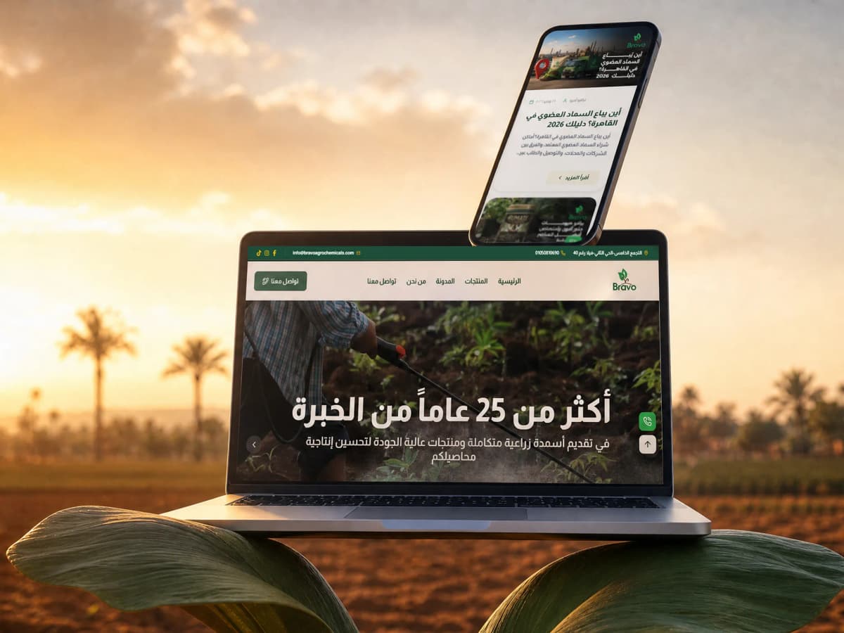
Twenty-five products across four categories, and an agronomy library written to the season. The audience are farmers arriving on a mid-range phone over a thin connection, searching by the problem rather than the product name, and those two facts shaped every decision on the build.

25

agricultural products, each with a page, an application rate and a registration

Client
Bravo Agrochemicals
Industry
Agricultural inputs, fertilisers and soil treatments

bravoagrochemicals.comOpen the site

bravoagrochemicals.com/

In short

01

The challenge

  • The audience arrives on a mid-range phone over a thin connection, so a heavy page means a visitor who never sees the product at all.
  • A farmer does not search by product name. They search by the problem: yellowing leaves, a fertiliser to raise yield, a crop feeding schedule.
  • Trust in this category is decided by official registration, and an unregistered product does not get bought whatever it looks like.
02

What we did

  • Images served in modern formats at sizes generated for the screen, and pages rendered on the server so the content arrives ready.
  • A library written in the phrasing the question actually takes, each article routing into the product that answers it.
  • Four separate sitemaps (static, categories, products, articles) so the catalogue can grow without disturbing indexing.
03

What came of it

  • A farmer now enters the site through the problem they can see in the ground (yellowing leaves, weak growth, new sandy soil) and comes out at the product that treats it.
  • The product page answers the questions that used to be asked at the dealer: the use, the crops, the application rate and the registration.
  • A library written to the season, which comes back into service every year instead of being read once and dying.

Project snapshot

How big a job this was

Medium. The catalogue itself is not large (25 products across four categories) but it comes with a content library that grows every month, a split indexing system built to absorb growth, and a hard performance constraint because the audience arrives on weak devices and weak connections. The size here comes from the library and the constraint, not from the product count.

Project size
Medium
Type of site
A product catalogue with an agronomy library
Who it speaks to
Farmers, farm owners, agronomists and dealers across the Egyptian governorates. Mostly on a mid-range phone, over a thin connection, sometimes from the field itself.
Built on
Next.js · Caddy · custom admin
  • 25

    products with their own page

    From organic fertilisers to growth regulators and micronutrients

  • 4

    catalogue categories

    Growth regulators, compound, organic and mineral fertilisers

  • 4

    separate sitemaps

    Static, categories, products, articles, so indexing stays orderly as it grows

  • 87 KB

    the home page document

    Measured on the live HTML, 6 September 2026

Scope delivered

  • Catalogue taxonomy and information architecture
  • Mobile-first UX and interface design
  • A Next.js build with a product and article dashboard
  • A content strategy built on the crop calendar
  • Technical SEO foundations with split indexing
  • Performance work on images and document weight

Technologies

  • Next.jsThe whole site, with pages rendered on the server
  • ReactThe interface components
  • CaddyWeb server and certificates
  • next/imageServing images in modern formats at fitting sizes
  • Schema.org JSON-LDDeclaring the company and its contact points
  • Custom adminProducts, categories and articles

The client

Whose site this is

Bravo is an Egyptian agrochemicals company that describes itself as having more than 25 years in the market. Its products divide into four families (growth regulators, compound fertilisers, organic fertilisers and mineral fertilisers) under which sit trade names farmers already recognise: Vitamar, Bravo Humate, Endoroot, Star Regulator, Akinaton.

The company is based in New Cairo and distributes through a dealer network across the governorates, and it leads with Ministry of Agriculture registration for its products. That is not marketing detail in this category: registration is the difference between a product that enters a farm and a product that gets a question mark next to it.

The company does not sell from the site. The sale happens at the dealer. That makes the site's job quite different from a store's: it builds the demand before the farmer reaches the dealer, and gives the dealer something to point at showing the product is registered and has a company behind it.

And because agricultural decisions are made by the calendar, the site has to be present at the right moment. Somebody searching for when to apply root feed to date palms is searching in a particular month, and if the page is not there then, it is not there at all.

Where it started

What the site was stalling on

Most fertiliser sites in Egypt are built the same way: a page of product photographs under their trade names, and that is all. That assumes the visitor knows the name of the product they want, and they do not.

A farmer searches by the problem they can see in the ground. Leaves yellowing, yield down, new sandy soil, date palms due their feed. None of those is a product name. So a catalogue that speaks only in trade names is waiting for a visitor who will never arrive.

There is a second constraint, harder and more important: the device and the connection. This visitor is not at a laptop in an office. They are on a mid-range phone, possibly somewhere with poor coverage, possibly standing in a field. A site that takes eight seconds to load under those conditions is not a slow site, it is an absent one. And every design decision that adds weight (a slider full of large photographs, too many typefaces, unoptimised images) converts directly into people closing the tab.

Finally, registration. In a category where a farmer is putting their money and their season on a product, the first question is not what does this do. It is whether it is registered. A site that does not answer that in the first screen loses a trust that is hard to win back.

  • The visitor searches by problem, not by product name, and a catalogue of trade names alone never gets found.
  • A mid-range phone on a thin connection, so weight is not a nicety. It is the difference between a visit and an exit.
  • Official registration is the first question, and has to be answered before anything is said about the product.
  • Agricultural decisions run on a calendar, so content has to exist in its own month rather than in any month.
  • The company does not sell online, so the site has to build demand that converts at a dealer.

The brief

What the new site had to do

  • The site opening fast on a mid-range phone over a thin connection.
  • A way in from the problem rather than from the product name.
  • Official registration visible in the first screen.
  • Every product with its own page, its uses, its crops and its application rate.
  • A library covering the calendar and routing into the products.
  • A catalogue that can grow without slowing the site or disturbing indexing.

Strategy

How the problem was approached

The strategy was built on a constraint rather than an ambition. The constraint is a mid-range phone on a thin connection, and every decision on the project was measured against it: does this add weight, and if so, is it worth it?

On top of that constraint sits one idea: the site is entered through the problem, not through the product. The library is the way in and the catalogue is the way out. A farmer searches for treating yellowing leaves, reads a page explaining the cause, and arrives from there at the product that addresses it, with the registration written beside it.

Performance as the first constraint

Performance here is not an optimisation done at the end. It is an architectural decision taken at the start. Pages are rendered on the server so the content arrives ready in the HTML instead of being assembled on a weak phone, and images are served in modern formats at sizes generated for the screen requesting them. The result is an 87 KB home page document. A number that opens on a thin connection.

Content as the entrance

The articles were written in the phrasing a farmer uses: best types of organic fertiliser, a crop feeding schedule, the difference between foliar and root feeding, whether organic fertilisers suit new desert land. Each answers the question properly first and routes into the product second. That order matters: an article that opens as an advertisement loses the reader before it can take them anywhere.

The calendar

A large share of the content is tied to timing: when to feed date palms, a tomato feeding programme, improving sandy-soil fertility. That content works in its own months, so the library is not an archive read once. It comes back into service every year in the same seasons.

Registration as the trust signal

Ministry of Agriculture registration was given a fixed, visible place rather than an About page. In a category where a farmer is staking a season, that signal precedes any claim about quality, because it is the only one that can be verified from outside.

Split indexing

Instead of one sitemap growing until it is hard to read, the site emits four separate maps: static, categories, products, articles. Adding twenty articles then touches one map only, and it becomes far easier to see what has been indexed and what has not, type by type.

Design

How it looks, and why each call was made

The design is green, clean and deliberately plain. The plainness is not taste, it is the consequence of the constraint: every extra element costs bytes downloaded over a thin connection, so the page was built from the fewest elements that do the work.

A product card shows the photograph, the name, the category and one line saying what the product does, because a farmer scans quickly and opens only what concerns them. The product page carries the use, the crops, the application rate and the registration: the things a farmer would otherwise ask the dealer.

Type is large and contrast is high. Part of this audience reads from a phone in direct sunlight, which is a punishing test of any colour system.

A light home page instead of a slider

A slider downloads photographs that will never be seen. On a thin connection that becomes delay in the first screen, and that delay becomes an exit.

One line on the product card

A farmer scans fast. One line saying what the product does lets the filtering happen in the catalogue itself, without opening five pages.

The application rate on the product page

It is the first question asked at the dealer. Written down, the farmer arrives already knowing, and the dealer sells faster.

Registration in a fixed place

The question is asked about every product. When the answer sits in the same place every time, the visitor stops hunting for it.

Large type and high contrast

Part of this audience reads from a phone in sunlight. A system that looks elegant in an office can be unreadable in a field.

The build

How it was built

The site is built on Next.js with server-rendered pages. That choice is not fashion here. It is about the content arriving ready for a device that is not powerful, rather than the device assembling it.

A product in the system is a record with fields: name, category, use, crops, application rate, photographs. An article is a record with its own. The dashboard makes adding either a few minutes' work, which matters because this library keeps growing. The articles is not a number written once, it is the result of continuous publishing.

And the indexing was split into four maps rather than one from the beginning, so that growth stays orderly.

  • A product record with fields: category, use, crops, application rate, photographs.
  • Four split sitemaps generated automatically as content is published.
  • Images in modern formats at sizes generated per screen.
  • Organization and ContactPoint data generated from the company record.
  • A dashboard for products, categories and articles, and a second for watching search.
  • Admin, login and API routes closed off in robots.

Features

What the site can do

A four-category catalogue

Growth regulators, compound, organic and mineral, each with its own page and URL.

A product page carrying the application rate

Use, crops, rate and registration. The things otherwise asked at the dealer.

An agronomy library

Written in the phrasing of the question and to the season, each routing into a product.

Indexing split across four maps

Static, categories, products and articles, so growth stays orderly and easy to watch.

A light document built for the weak phone

An 87 KB home page, with images in modern formats at generated sizes.

A dashboard for continuous publishing

A product or an article added in minutes, because this library grows every month.

Measurement

Figures you can check yourself, right now

Open the domain and run PageSpeed on it. These are the figures you should find.

  • 97

    Performance

    Lighthouse desktop: run against the published domain, 6 September 2026

  • 92

    Accessibility

    Lighthouse desktop: run against the published domain, 6 September 2026

  • 100

    Best Practices

    Lighthouse desktop: run against the published domain, 6 September 2026

  • 92

    SEO

    Lighthouse desktop: run against the published domain, 6 September 2026

Build detail. These are Lighthouse figures against the published domain, and the highest performance score in the set, which is not chance, it is the constraint the whole project was built around.

The home page is 87 KB, every image is served in a modern format at a size generated for the screen that asked for it, and the page arrives built from the server rather than assembled on a weak phone. That is what earns Performance 97 and Best Practices 100.

Accessibility at 92 leaves a little room, and SEO at 85 wants meta descriptions on the product pages. Both known maintenance items done from the dashboard.

And indexing was split across four maps from the start (static, categories, products, articles) so a library growing every month does not become one large file nobody can watch.

Search

What was set up for Google to read

Search is the main source of traffic here, and its character is different: people search by problem and by timing. So the content was built on both (treating yellowing leaves is a problem, when to apply root feed to date palms is a timing) with every page routing into the product it concerns rather than leaving the reader at the end.

  • A readable Arabic URL for every product, category and article.
  • Four split sitemaps generated automatically: static, categories, products, articles.
  • A robots file opening the catalogue and closing admin, login and API.
  • Organization and ContactPoint data so the company is understood as an entity.
  • A title and description written per page rather than generated from its name.
  • Open Graph and Twitter cards so the link renders properly when sent on WhatsApp.
  • Alt text on every image, 16 of 16.
  • Internal linking from every article into the product that answers it.

01·From the build

What was actually built

This site is smaller than the others in product count and larger in content, and the division shows why.

The catalogue, 25 products, each with its own page: Akhenaton FM, Endogozour, Vitamar El Gabbar, Vitamar Golden Black, Vitamar Powder, Bravo Humate 2, Semad El Ageeb, Cyto Dodge, Cytovalley, Fluoroquine, Bravo Tiger, Star Regulator, New Max Boron, Tiger Potash, NewMax Calcium, Alg Potash, Ligno MZ, Redo Comp and others. Four categories gather them: growth regulators, compound fertilisers, organic fertilisers and mineral fertilisers.

The agronomy library. The articles, by a wide margin the largest part of the site. Not a company blog: the primary way in from search.

The company pages, experience, registration and the distribution network, and a contact page with two routes, one for dealers and one for farmers, because the two ask different things.

The infrastructure. A dashboard from which a product or an article is added in minutes, and four separate index maps generated automatically as content is published.


02·From the build

The constraint every decision was measured against

Most projects begin with an ambition. This one began with a constraint.

The visitor here is not at a laptop in an office. They are on a mid-range phone, often somewhere with poor coverage, sometimes standing in the field itself. A site that takes eight seconds to load under those conditions is not a slow site. It is an absent one.

So every decision on the project was measured against one question: does this add weight, and if so, is it worth it?

That is what explains the look of it. Green, clean and deliberately plain, and the plainness is not taste. It is the consequence of the constraint. Every extra element costs bytes downloaded over a thin connection, so the page was built from the fewest elements that do the work.

A product card shows the photograph, the name, the category and one line saying what the product does, because a farmer scans quickly and opens only what concerns them. Type is large and contrast is high, because part of this audience reads from a phone in direct sunlight, which is a punishing test of any colour system.

03·From the build

The library is the way in; the catalogue is the way out

Most fertiliser sites in Egypt are built the same way: a page of product photographs under their trade names, and that is all. It assumes the visitor knows the name of the product they want, and they do not.

A farmer searches by the problem they can see in the ground. Leaves yellowing, yield down, new sandy soil, date palms due their feed. None of those is a product name. So a catalogue speaking only in trade names is waiting for a visitor who will never arrive.

So the order was inverted: the library became the way in and the catalogue the way out. A farmer searches for treating yellowing leaves, reads a page explaining the cause, and arrives from there at the product that addresses it, with the registration written beside it.

And the content is written along two axes rather than one: the problem. The causes of yellowing leaves and their treatment, how to improve the fertility of sandy soil, and the timing, when to apply root feed to date palms, the best way to feed tomatoes. That second axis is what makes the library an asset that keeps returning to work: an article written to a season is read again every year in the same month.

04·From the build

The first question is not what does this do

In a category where a farmer is putting their money and their season on a product, the first question is not what does this do. It is: is it registered?

A site that does not answer that in the first screen loses a trust that is hard to win back. So registration and experience were put at the top of the home page rather than inside an About page.

The product page itself was built from the questions a farmer used to ask the dealer: the use, the crops it goes on, the application rate, and the registration. That information is not supplementary content. It is what lets a farmer decide before walking to the dealer, and it lets the dealer use the product page as a reference in front of a customer.

The contact page was split into two routes for the same reason: a dealer asks about wholesale and distribution rights, a farmer asks about a product for their land. Behind one shared form, both get a slower and vaguer answer.

05·From the build

A library growing every month, and a system built to carry it

That library is not a number written once. It is the output of continuous publishing, and it grows every month.

If a site is not prepared for that growth it becomes a burden rather than an asset: indexing gets muddled, and a single sitemap grows to the point where nobody can tell from it what has been indexed and what has not.

So indexing was split from the start across four separate maps: static, categories, products and articles. That decision was taken before the library grew rather than after, and it is what keeps indexing watchable: if articles stop being indexed, it shows in the articles map on its own instead of disappearing among everything else.

In the dashboard, a product is a record with its fields (category, use, crops, application rate, photographs) and an article is a record with its own. That is what makes adding either a few minutes' work, and it is the only condition under which a library this size actually keeps growing rather than stalling at the first twenty articles.

The phases

How the work ran

Starting from the constraint

Establishing the audience and its devices: farmers on mid-range phones over thin connections. That constraint became the test for every later decision.

Content mapping

Collecting the real search phrasings and sorting them into problems and timings, which defined the library.

Taxonomy

Four product families, with each product tied to its crops and uses.

Design

A visual system with as few elements as possible, with large type and high contrast for reading in sunlight.

Build

Next.js with server-rendered pages, a field-based product record, and four split sitemaps.

Content

Loading 25 products, and building the library article by article as publishing went on.

Launch and watching the split indexing

Launch, with indexing watched per type across the four maps.

Handover

What became yours

  • Domain, hosting and source files in the client's name from day one
  • A control panel the content is edited from without a developer
  • A walkthrough for whoever takes the site over afterwards
  • A month of monitoring and fixes after launch

Outcome

The outcome

The site now speaks the farmer's language rather than the catalogue's.

Somebody seeing yellowing leaves does not know the name of the product that treats it, but they do know what they are looking at. So they search by the problem, find an article explaining the cause, and end at the product that addresses it, with the application rate, the crops and the registration written beside it. The questions that used to have to be asked at the dealer are now written on the page.

And all of it opens quickly on a mid-range phone in a place with poor coverage, because that is this audience's real device and real circumstance rather than the exception.

The short version: a catalogue speaking in trade names to an audience searching by problems, and a hard technical constraint called a mid-range phone on a thin connection. It was solved by making the library the way in and the catalogue the way out, and by measuring every design decision against one question: does this add weight? The result is a 91-article library that returns to service every season, and a page that opens in a field as readily as in an office.

Delivery figures

  • 25

    products with a page, an application rate and a registration

    Counted in the published sitemap, 6 September 2026

  • 4

    catalogue categories, each with its own way in

    Counted in the published sitemap, 6 September 2026

  • 4

    separate index maps built to absorb the library's growth

    Counted in the published sitemap, 6 September 2026

  • 87 KB

    the home page document, so it opens in a field

    Measured on the live HTML, 6 September 2026

Work like this starts with a call about where you actually are

If this is close to what you need, the Web development page carries the whole method: what you receive, and the number the work answers to.

Our clients

Companies that chose to work with us

Some of our clients, across sectors with nothing in common.

  • Bravo Agrochemicals
  • El Masrya Office Furniture
  • Tareek El Shifa Center
  • Dr Ghada Yousry
  • Interact Labs
  • rawa
  • Next Industry
  • Medixia.ai
  • Falcon Water Treatment Systems
  • Golden Blast
  • Happy Plastics
  • Smart Modern School
  • Rafiq Academy
  • IPS Sports Academy
  • Mo Valley
  • Hyalure
  • G-Tour
  • Préime
  • Rahal
  • Dausar
  • El Gamry