Web development

Dar El Jamal · Healthcare Platform

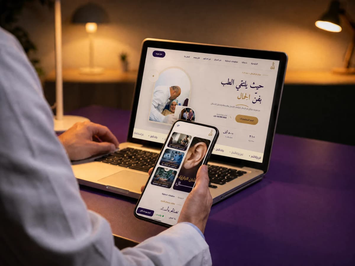
One centre holding three unrelated specialities (cosmetic surgery, dentistry and weight-loss surgery) and a patient who arrives for exactly one. Built as 22 service pages, each findable, persuasive and bookable on its own without passing through the other two.

22

service pages, each findable and bookable on its own

Client
Dar El Jamal
Industry
Aesthetic medicine, dentistry and bariatric surgery

dar-eljamal.comOpen the site

dar-eljamal.com/

In short

01

The challenge

  • Three unrelated specialities in one centre: cosmetic surgery, dentistry and bariatrics. Somebody coming for an implant does not care about rhinoplasty.
  • The decision is expensive, personal and taken over weeks, with the patient comparing privately and leaving no details behind.
  • The real evidence in this category is before-and-after results, and that is sensitive material that has to be shown with consent and with care.
02

What we did

  • 22 independent service pages, each with its own URL and its own booking route, so each can be reached directly from search.
  • Qualifying tools ahead of the consultation: a short quiz that suggests the procedure, and a body-mass calculator for the bariatric route.
  • A before-and-after gallery with an interactive comparison, and Google reviews shown as they stand rather than written testimonials.
03

What came of it

  • Each of the 22 services now works as a small site in its own right: findable, persuasive and bookable, without the patient passing through two specialities that have nothing to do with them.
  • A patient compares a before-and-after result themselves by dragging a divider across the frame, instead of studying two pictures side by side and doing the comparison in their head.
  • Two tools qualify the patient before the consultation: a quiz that suggests the procedure to somebody who cannot name it, and a body-mass calculator that says whether they are a candidate for weight-loss surgery at all.

Project snapshot

How big a job this was

Large. 22 services across three unrelated specialities, an aesthetic-information library, three branches with their own hours, a before-and-after gallery with an interactive comparison, and two interactive qualifying tools. The complexity is not in the page count. It is that each of the 22 services has to function as a small site in its own right.

Project size
Large
Type of site
A multi-speciality clinic site
Who it speaks to
Patients researching one specific procedure, most of them comparing centres for weeks, reading privately from a phone. A share of them consult from outside Egypt.
Built on
Next.js · Caddy · custom dashboard
  • 22

    service pages

    From rhinoplasty and breast surgery to dental implants and endoscopic weight-loss

  • 3

    unrelated specialities

    Cosmetic surgery, dentistry and endoscopic weight-loss surgery

  • 3

    branches with their own address and hours

    Mohandessin, Sheikh Zayed and New Cairo

  • 2

    interactive tools qualifying the patient

    A quiz that suggests the procedure, and a body-mass calculator for the bariatric route

Scope delivered

  • Strategy and positioning
  • Information architecture across three specialities
  • UX and booking journeys
  • Interface design in a premium visual language
  • A Next.js build with a content dashboard
  • Interactive tools: a recommendation quiz and a calculator
  • Technical SEO foundations, per service

Technologies

  • Next.jsThe whole site, with pages rendered on the server
  • ReactThe interactive tools and the before-and-after comparison
  • CaddyWeb server and certificates
  • next/imageResult photography in modern formats at fitting sizes
  • Custom dashboardServices, articles and before-and-after cases

The client

Whose site this is

Dar El Jamal is a Cairo medical centre that describes itself as the place where medicine meets the art of beauty, operating since 2003. It brings together under one roof three fields that have no clinical relationship to each other: cosmetic surgery (nose, breast, facelift, body contouring, reconstruction, burns and scars; dentistry and dental aesthetics) implants, orthodontics, prosthetics, endodontics, gum treatment, paediatric dentistry; and endoscopic weight-loss surgery. Alongside those sit fillers and Botox, laser hair removal and hair transplantation.

The centre runs three branches (Mohandessin, Sheikh Zayed and New Cairo) and presents its founder, Prof. Ibrahim Kamel, professor of cosmetic surgery and a member of the French society of aesthetic surgery, as the primary face of trust. The figures the centre displays on its site (years in practice, people treated, branches) are its own published claims.

A cosmetic procedure is decided over weeks and researched in complete privacy. The patient reads from their phone, compares centres, looks at results and reads reviews. All without speaking to anybody. The first real contact with the centre happens after the decision is more or less made.

Which means the site is not a marketing tool sitting beside the clinic. It is an entire stage of the patient journey that takes place before any call. A centre whose site does not answer the questions of that stage gets dropped from the comparison without ever knowing it was in one.

Where it started

What the site was stalling on

The central problem here is structural rather than visual: one centre offering three specialities with no relationship to one another, and a patient who comes for exactly one.

Somebody searching for a dental implant wants to know the type of implant, the warranty, the timeline and the cost. Somebody searching for rhinoplasty wants to see results and know who will be operating. Somebody searching for endoscopic weight-loss wants to know whether they qualify at all. Three entirely different questions, at three different levels of anxiety.

A site that puts all three behind a page called Our Services makes two mistakes at once. It loses search, because no page matches any of those questions and so none of them surfaces. And, more damaging, it signals that this is a general place rather than a specialist one, and somebody researching rhinoplasty is looking for a specialist, not for a centre that does everything.

On top of that, the evidence in this category is photographic. Before-and-after results are the only thing that genuinely persuades, and they are simultaneously the heaviest content that can go on a page and the most sensitive in privacy terms. So the decision is not whether to show photographs. It is how to show them respectfully, with consent, and without making the page unusable on a phone.

  • Three unrelated specialities, and a patient who comes for only one of them.
  • A single Our Services page loses search and signals a general practice rather than a specialist one.
  • The evidence is before-and-after photography. The heaviest and the most sensitive content at once.
  • The decision is made privately, so the patient will not leave details before being convinced.
  • Three branches with different addresses and hours, and a patient who wants the nearest.
  • Medical terminology read by non-clinicians, so the copy has to work twice over, accurately and plainly.

The brief

What the new site had to do

  • Each of the 22 services on a full page with its own URL, findable from search.
  • A booking route from every service page, not from one shared contact page.
  • Results shown in a way that persuades and respects privacy at the same time.
  • A patient able to tell whether they qualify before booking a consultation.
  • The founding surgeon present as the face of trust on every route.
  • Branches clear with their addresses and hours, so a patient reaches the nearest.

Strategy

How the problem was approached

The core strategic decision was to lead with the service rather than with the centre.

The site does not say we are Dar El Jamal and here is what we do. It says to each patient: this is the procedure you were looking for, this is what happens in it, these are its results, this is who performs it, and here is how to book. The centre introduces itself inside the patient's own service page rather than before it.

That inversion sounds small and it changes everything: the page count, the shape of the navigation, where booking lives, and even the order of the home page, whose job became routing a visitor to their own service as fast as possible instead of talking about the centre.

Information architecture

22 services, each a full page on its own URL. The split respects the fact that the three specialities are clinically separate: a patient who entered on dental implants moves among dental services and is not shown cosmetic surgery. That is what lets the centre read as specialist on each route instead of general across all of them.

The patient journey

The journey is designed as three stated steps: book a consultation, meet the specialist, begin treatment. That clarity lowers the anxiety of a first stage full of unknowns, and gives the patient a picture of what comes next before committing to anything.

Qualifying before the consultation

Two interactive tools work before any booking: a three-question quiz that suggests the right procedure to somebody who does not know its name, and a body-mass calculator telling a patient whether they are a candidate for weight-loss surgery.

These are not ornaments. They solve two problems at once: a patient who cannot name the procedure finds their way to it, and the clinic receives qualified consultations instead of calls that end with this case is not suitable.

The evidence

The before-and-after section uses an interactive comparison so the difference is seen inside a single frame rather than as two photographs side by side. Reviews are shown as they stand on Google rather than rewritten as testimonials, because a review the patient can go and verify on another platform carries more weight than any quotation hosted on the site.

Booking

The booking route lives on every service page, with WhatsApp available around the clock beside it. The reason is that a patient decides in the moment they are convinced, and if booking requires going back to a menu to find a contact page, that moment passes.

Content

an aesthetic-information library works the stage before: somebody reading about Botox or about cosmetic surgery in Cairo is still learning, not booking. That content answers their questions and hands them to the service page when they are ready, rather than waiting for them to search a procedure name they do not yet know.

Design

How it looks, and why each call was made

The visual language here has to say serious place before it says anything else. Deep purple with gold, a classical Arabic face for the headings, and generous space. The refinement is not decoration. It is a positioning signal: a patient reads the level of a clinic off the page long before they read a word about price.

At the same time the clinical seriousness has to stay visible. So the page balances the two: the aesthetic half takes its room in the photography and the detail, and the medical half takes its room in the explanation, the qualifications and the steps.

Result photography was treated as the central content rather than as a gallery: it lives inside an interactive comparison where the visitor drags the divider and sees the difference for themselves, instead of studying two pictures side by side and doing the comparison in their head.

An interactive comparison instead of two photographs

Two photographs side by side make the comparison the viewer's work. A moving divider puts both in one frame, so the difference is seen rather than calculated.

Google reviews as they stand

A testimonial written on the site convinces nobody. A review the patient can open on another platform carries far more weight.

Booking on every service page

The patient decides in a moment of conviction. If booking requires going back to a menu, the moment passes and the decision is deferred.

A classical Arabic face for headings

Type states level in this category. A cold system face reads as a general clinic; a classical face reads as a place that cares about detail, which is exactly what is being sold.

Branches with their full hours

Patients choose on distance. An address without hours generates a question call; an address with its hours generates a booking.

Qualifying tools before the form

A form asks the patient to commit before they understand. A tool gives them information about their own case first, and lets them decide to commit after.

The build

How it was built

The site runs on Next.js with server-rendered pages, which is what makes 22 service pages genuinely present to search with their content rather than routes assembled in the browser. Measured on the home page, 1,274 words are readable with JavaScript switched off, meaning the clinical copy itself is in the HTML rather than fetched afterwards.

A service in the system is a record with its own fields: name, speciality, explanation, steps, frequently asked questions, related cases. A before-and-after case is a separate record carrying two photographs and the procedure type, so it can appear on the service page and in the general gallery without being entered twice.

The interactive tools (the quiz and the calculator) were built as components that run in the browser on top of a page that already exists, so their presence does not cost the page its readability without JavaScript.

  • A service record with fields: speciality, explanation, steps, FAQs, related cases.
  • A separate before-and-after case record appearing on the service page and in the gallery.
  • An interactive comparison with a draggable divider.
  • A three-question recommendation quiz, and a body-mass calculator for the bariatric route.
  • A floating WhatsApp available around the clock, and a short form on every service page.
  • A dashboard for services, articles and cases, and a second for watching search.

Features

What the site can do

22 independent service pages

Each with its own URL, explanation, steps, questions and booking route.

A before-and-after gallery with an interactive comparison

A draggable divider showing the difference in one frame, sorted by procedure.

A procedure recommendation quiz

Three questions suggesting the right procedure to somebody who cannot name it.

A body-mass calculator

Tells a patient whether they are a candidate for weight-loss surgery before booking.

Google reviews on the page

Real reviews the patient can open themselves, instead of written testimonials.

Three branches with their hours

Full addresses and daily hours, so the patient picks the nearest.

Round-the-clock WhatsApp

Available from any page, because the decision is made in a moment rather than in office hours.

An aesthetic-information library

Working the understanding stage before the decision and handing over to the service page.

Measurement

Figures you can check yourself, right now

Open the domain and run PageSpeed on it. These are the figures you should find.

  • 96

    Performance

    Lighthouse desktop: run against the published domain, 6 September 2026

  • 92

    Accessibility

    Lighthouse desktop: run against the published domain, 6 September 2026

  • 96

    Best Practices

    Lighthouse desktop: run against the published domain, 6 September 2026

  • 85

    SEO

    Lighthouse desktop: run against the published domain, 6 September 2026

Detail beneath the surface. These are Lighthouse figures against the published domain.

Performance 96 and Best Practices 96 on a site carrying 22 service pages, a results gallery and two interactive tools, which comes from pages rendering on the server and the tools running on top of a page that already exists rather than in place of it.

SEO at 85 is the lowest figure, and its cause is specific and written here as it is: pages ship without a per-page title and meta description. The structure and the content are there; that field needs filling across every page, content maintenance rather than a rebuild.

On the content itself: 1,340 words readable on the home page with JavaScript switched off, meaning the clinical explanation is present in the document the server sends. The condition that lets each service page be found on its own.

Search

What was set up for Google to read

The working rule here was that any procedure searched for independently gets a page of its own. Dental implants, orthodontics and root-canal treatment are three different questions from three different people, and putting them behind one page called Dentistry means being absent from three results instead of present in one.

  • A page and a readable Arabic URL for each of the 22 services.
  • A canonical on every page, with a robots meta allowing indexing and following.
  • The clinical copy present in the HTML rather than fetched with JavaScript.
  • Alt text on every image, 16 of 16.
  • A published sitemap carrying every page, with robots closing the dashboard, login and API.
  • Open Graph set so the link renders properly when sent on WhatsApp.
  • Internal linking from every information article into the service it concerns.

01·From the build

What was actually built

It is the division rather than any total that describes this work.

The specialities and their services, 22 service pages across three unrelated fields. Cosmetic surgery: rhinoplasty, eyelid and ear surgery, breast and chest, four-dimensional sculpting, reconstruction and burns and hand and scar surgery, female and male aesthetics, and hair transplant and removal. Dentistry and dental aesthetics: implants, orthodontics, root-canal and microscopic endodontics, prosthetics, paediatric dentistry, maxillofacial surgery, periodontal disease and surgery, and smile design. And endoscopic weight-loss surgery. Alongside them, filler and botox and laser hair removal.

The evidence. A before-and-after gallery with an interactive comparison, sorted by procedure, where a single case appears both on its service page and in the general gallery without being entered twice.

The qualifying tools. A three-question quiz that suggests a procedure, and a body-mass calculator for the bariatric route.

Operations, three branches with their addresses and hours, a WhatsApp available around the clock, an online payment page, and consultation booking. Plus a aesthetic-information aesthetic-information library working the understanding stage before the decision.
02·From the build

One centre, three specialities with nothing in common

The central problem here is structural rather than visual: one centre offering three specialities with no relationship to one another, and a patient who comes for exactly one.

Somebody searching for a dental implant wants to know the type of implant, the warranty, the timeline and the cost. Somebody searching for rhinoplasty wants to see results and know who will be operating. Somebody searching for endoscopic weight-loss wants to know whether they qualify at all. Three entirely different questions, at three different levels of anxiety.

A site that puts all three behind a page called Our Services makes two mistakes at once. It loses search, because no page matches any of those questions and so none of them surfaces. And, more damaging, it signals that this is a general place rather than a specialist one, and somebody researching rhinoplasty is looking for a specialist, not for a centre that does everything.

So the strategic decision was to invert the order. The site does not say we are Dar El Jamal and here is what we do. It says to each patient: this is the procedure you were looking for, this is what happens in it, these are its results, this is who performs it, and here is how to book. The centre introduces itself inside the patient's own service page rather than before it.

That inversion sounds small and it changes everything: the page count, the shape of the navigation, where booking lives, and even the order of the home page, whose job became routing a visitor to their own service as fast as possible instead of talking about the centre.

03·From the build

The evidence in this category is a photograph, and photographs here are sensitive

In aesthetics, the only thing that genuinely persuades is a before-and-after result. It is simultaneously the heaviest content that can go on a page and the most sensitive in privacy terms.

So the question was never whether to show photographs. It was how to show them respectfully, with consent, and without making the page unusable on a phone.

The answer was an interactive comparison: one frame, with a divider the visitor drags themselves to see the difference. That is not a visual effect. It is a shortcut through a mental operation. A visitor looking at two pictures side by side is trying to align them in their head and comes away with an uncertain impression; a visitor dragging a divider sees the change on the same face at the same angle, and the result lands without a word.

A case was made an independent record carrying two photographs and the procedure type, so it appears on the service page and in the general gallery without anybody entering it twice. That is not internal housekeeping. It is what keeps the gallery ordered a year later instead of turning into a pile of images.

Beside it sit real Google reviews rather than written testimonials. Nobody believes a testimonial typed onto a clinic's own site; a review the visitor can open themselves, with a name attached, does work.

04·From the build

Qualifying the patient before the consultation

Two kinds of visitor waste the centre's time and their own: the one who cannot name the procedure they need, and the one who books a consultation for an operation they were never a candidate for.

The first was solved with a three-question quiz. Somebody who can see something they want changed but does not know what the procedure is called walks through three questions and comes out with a recommendation pointing at a specific service page. That turns a lost visitor into an arrived one, and prevents the general enquiry that takes a whole phone call to narrow down.

The second was solved with the body-mass calculator on the bariatric route. It tells the visitor plainly whether they qualify, before they book. That tool reduces bookings on paper, and improves them in fact, because somebody booking after the calculator is arriving for a consultation that means something rather than for a screening call.

Both were built as components running in the browser on top of a page that already exists, so their presence does not cost the page its readability without JavaScript.

05·From the build

A visual language that says serious place before it says anything else

A patient reads the level of a clinic off the page long before they read a word about price. So the visual language here is not decoration. It is a positioning signal.

Deep purple with gold, a classical Arabic face for the headings, and generous space. That refinement carries a message no paragraph can: this is not a cheap place and not a haphazard one.

At the same time the clinical seriousness has to stay visible, because this is ultimately a centre performing surgery. So the page balances the two: the aesthetic half takes its room in the photography and the detail, and the medical half takes its room in the explanation, the qualifications and the steps.

Booking was treated on the assumption that the decision is made in a moment rather than during office hours. So WhatsApp runs around the clock and is reachable from any page, there is a short form on every service page and an online payment page, and three branches with their addresses and hours, so the patient picks the nearest one without a call.

The phases

How the work ran

Taking the three specialities apart

Sessions with the clinical and administrative team to understand the clinical separation between the three specialities, and a review of the questions reception hears repeatedly.

Strategy

The decision to build from the service rather than from the centre, which set the page count and the shape of the navigation.

Information architecture

Sorting 22 services across three specialities, and tying cases and articles to each.

Content

Writing the service pages under clinical review, in language a non-specialist can follow.

Design

A premium visual language whose colour and type state the level, with the before-and-after comparison as a core component.

Build

Next.js, a field-based service record, an independent case record, and the interactive tools.

Launch and a review of the booking routes

Launch, with indexing watched for each of the 22 services separately.

Handover

What became yours

  • Domain, hosting and source files in the client's name from day one
  • A control panel the content is edited from without a developer
  • A walkthrough for whoever takes the site over afterwards
  • A month of monitoring and fixes after launch

Outcome

The outcome

The site now treats the centre as what it actually is: not one place offering three specialities, but 22 services each with its own patient, its own question and its own level of anxiety.

Somebody searching for a dental implant finds the dental implant page (its explanation, its steps, its questions, its results and its booking route) without passing through cosmetic surgery or bariatrics. Somebody who cannot name the procedure they need goes through a three-question quiz that suggests it. Somebody considering weight-loss surgery learns from the body-mass calculator whether they are a candidate at all, before booking a consultation.

And the results (the real evidence in this category) are shown through an interactive comparison where the visitor drags a divider across a single frame, sorted by procedure.

Summed up: a centre holding three specialities that have nothing to do with each other, and a patient who comes for exactly one. It was solved by inverting the order (the service comes first and the centre introduces itself inside the patient's own page rather than before it) and by giving every independently searched procedure a page of its own. Twenty-two ways in instead of one, each ending at a booking.

Delivery figures

  • 22

    independent service pages across three specialities

    Counted in the published sitemap, 6 September 2026

  • 3

    branches with their addresses and hours

    The published contact page

  • 2

    interactive tools qualifying the patient before the consultation

    The published site

  • 1

    single frame with a draggable divider, instead of two pictures side by side

    The published before-and-after gallery

Work like this starts with a call about where you actually are

If this is close to what you need, the Web development page carries the whole method: what you receive, and the number the work answers to.

Our clients

Companies that chose to work with us

Some of our clients, across sectors with nothing in common.

  • Bravo Agrochemicals
  • El Masrya Office Furniture
  • Tareek El Shifa Center
  • Dr Ghada Yousry
  • Interact Labs
  • rawa
  • Next Industry
  • Medixia.ai
  • Falcon Water Treatment Systems
  • Golden Blast
  • Happy Plastics
  • Smart Modern School
  • Rafiq Academy
  • IPS Sports Academy
  • Mo Valley
  • Hyalure
  • G-Tour
  • Préime
  • Rahal
  • Dausar
  • El Gamry