Web development

Tareq El Shifa · Healthcare & Content Platform

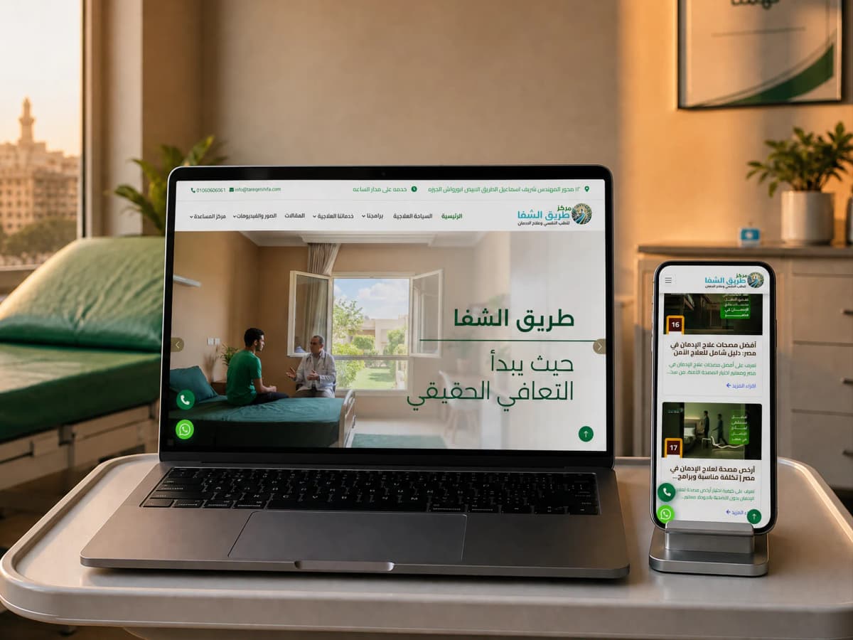
Families do not search for addiction treatment. They search by the name of the substance. So the site was built from search inwards: 24 programme and treatment pages, each on a URL matching the question that was typed, and a number that answers in the shell of every page.

24

programme and treatment pages, each on its own URL

Client
Tareq El Shifa Centre for Psychiatry and Addiction Treatment
Industry
Healthcare, addiction treatment and psychiatry

tareqelshifa.comOpen the site

tareqelshifa.com/

In short

01

The challenge

  • A visitor searching on the worst day of their year, who needs to know inside three seconds that the place is licensed and that somebody will answer now.
  • The whole category is usually sold on one generic services page, while the searching is done by the name of the substance rather than the phrase addiction treatment.
  • The subject carries a stigma, so anything on the page that hints at exposure loses the call.
02

What we did

  • A page of its own for each programme and each substance or behaviour, so the URL matches the question that was typed.
  • Licensing, the phone number and WhatsApp put at the top of the page rather than behind a contact link.
  • MedicalOrganization structured data with the address and coordinates, so the centre is read as a medical facility rather than a content site.
03

What came of it

  • The site now receives a visitor at the question they arrived with (the name of a substance, the name of a programme, or a question that comes before the decision) rather than only at the home page.
  • 24 programme and treatment pages, each on a readable Arabic URL matching the phrasing people actually search.
  • A phone number and a WhatsApp in the shell of every page, so somebody unwilling to leave their details can take the number and go.

Project snapshot

How big a job this was

Medium to large. Not for technical complexity, but because it carries 24 treatment pages with 24 different search intents behind them, a library that keeps growing, and a conversion path that has to work from every one of them without frightening the reader off.

Project size
Medium to large
Type of site
Treatment-centre site with an editorial library
Who it speaks to
Families searching on behalf of someone close, and patients searching for themselves, from Egypt, the Gulf and Jordan. Mostly on a phone, often late, usually in a crisis.
Built on
PHP 8.2 · LiteSpeed · Bootstrap 5 · jQuery
  • 8

    treatment programmes

    Full residency, half residency, detox, twelve steps, dual diagnosis, family support, 28 days, relapse prevention

  • 16

    substance and behaviour pages

    From heroin and tramadol to gambling, gaming and compulsive shopping

  • 24

    pages with a search intent of their own

    Programmes and treatments together, each on a URL matching its question

  • 2

    contact routes on every page

    A call and WhatsApp, with no page missing either

Scope delivered

  • Information architecture built from search intent
  • UX and interface design
  • Front-to-back build with a content dashboard
  • Technical SEO foundations and structured data
  • Structuring the article library

Technologies

  • PHP 8.2The application itself
  • LiteSpeedWeb server
  • Bootstrap 5Layout grid and components
  • jQueryIn-browser interactions
  • Owl CarouselDoctor and gallery carousels
  • Schema.org JSON-LDDeclaring the centre as a medical facility

The client

Whose site this is

Tareq El Shifa is a psychiatric and addiction treatment facility in Abu Rawash, Giza, open around the clock, which describes itself on its own site as one of the larger centres in the region. It runs full and half residency, medically supervised detox, a twelve-step programme, dual-diagnosis care, family support and relapse prevention, covering opioids, stimulants and alcohol alongside behavioural addictions such as gambling, gaming and compulsive shopping.

The centre publishes its own figures (years in operation, bed count, people treated, recovery rates) and invites the reader in as many words to ask to see the licences. A dedicated medical-tourism page tells you something else: a meaningful share of the demand arrives from the Gulf and Jordan rather than from Giza.

In this category a website is not a brochure. It is the first thing opened, often the only thing opened, before a call in which large decisions get made. A family comparing centres is not comparing layouts; they want two answers. Is this place real and licensed, and will somebody answer now or in the morning. A page that does not settle both in the first screen loses the call to a centre that answered faster.

Where it started

What the site was stalling on

The problem in this category is not that the sites look dated. It is that they are all built the same way: a home page of general encouragement about recovery, one page called Our Services carrying a list, and a contact page. And the visitor does not arrive at the home page at all.

Searching here happens by the name of the substance. Tramadol addiction treatment. Lyrica withdrawal symptoms. A rehab clinic in Cairo. What does treatment cost. Each of those is a different question, and the person asking about cost is not at the same stage as the person asking about withdrawal. A site that answers seventeen such questions with one general page loses all seventeen, because it matches none of them exactly.

There is a harder layer underneath. Stigma. This visitor does not want to leave their details, and a long form reads to them like a register. What actually happens is that people take the number, leave the site, and call from a different phone. So the site has to succeed at something no click will ever record: delivering the number and the reassurance with as little friction as possible.

  • A different search intent per substance and per programme, and one generic page matching none of them.
  • Trust has to be built before the visitor reads two lines, licensing, named doctors, a real address.
  • Stigma turns a long form into something that reads like a register, so the real conversion happens on a phone, not in a field.
  • Part of the audience is outside Egypt, so the site has to answer travel and residency questions too.
  • The editorial library keeps growing, and has to stay ordered rather than turning into a shapeless archive.

The brief

What the new site had to do

  • A separate URL for each question being searched, instead of one page answering all of them.
  • Licensing and accreditation visible in the first screen, not on an About page.
  • A call or a WhatsApp reachable from any page without going back to a menu.
  • Doctors by name and speciality, so the trust attaches to people rather than to a logo.
  • A separate route for the visitor arriving from outside Egypt.
  • A library that can grow without breaking the order of the site.

Strategy

How the problem was approached

The approach was easy to say and slow to do: build this site from search inwards, not from the home page outwards. The first decision on the project was not the header treatment or the button colour. It was how to divide the content by the kind of question people arrive with.

The questions sort into three families, and each family got a different place in the site. I have this problem went to the substance and behaviour pages. How does treatment actually work went to the programme pages. I am still trying to understand went to the library. All three converge on one point: the number.

Reading the search intent

We started from demand rather than from competitors: what phrasings do people actually type. Three patterns came out clearly, searching by substance, searching by place (in Cairo, in Giza, in Alexandria) and searching by cost. Most centres ignore the third because it is an awkward question to answer. It is also the most serious one, because the person asking it has reached the comparison stage.

Information architecture

The site split into two independent layers instead of one list. The Programmes layer answers what does treatment look like: full residency, half residency, detox, twelve steps, dual diagnosis, family support, 28 days, relapse prevention. The Treatments layer answers what do I have: heroin, tramadol, Lyrica, Captagon, alcohol, cocaine, crystal, and then the behavioural side, gambling, sex, internet, gaming, compulsive shopping, work.

That split is not housekeeping. It is what lets the URL itself match the question, which is the difference between a search result that gets opened and one that gets scrolled past.

Trust

Trust here is measured in concrete things: the Ministry of Health licence, a full address with its coordinates, doctors by name and speciality, photographs and video of the place itself. Each has a fixed home in the site, and the home page tells the reader in as many words to ask about the licences. A line that works precisely because it turns the suspicion around instead of ignoring it.

Conversion

Conversion here is not a form. This visitor will not surrender their details easily, so the primary path became a call or a WhatsApp reachable from anywhere on the site, with the form left in place as a second option for whoever prefers it. It sounds like a small decision and it changes the design of every page: each treatment page has to end at the number, not at a link to a contact page.

Search

Every treatment and programme page has a stable URL and a title and description written for it rather than generated from a template. The facility itself is declared to search with MedicalOrganization data carrying the address, the coordinates and the contact routes, so that Google reads a medical facility with a place on the map rather than a site that talks about addiction.

Content

The library was built to answer rather than to fill. Articles take the questions that do not deserve a full treatment page (what does treatment cost, can someone stop without help, how do I help a relative) and link each into the treatment page it belongs beside. That is what makes a library work as a way into the site instead of an archive closed on itself.

Design

How it looks, and why each call was made

The job of the design here is to lower the temperature, not to impress. The visitor arrives tense, and anything visually loud raises the tension and makes the place read as less serious. So: a quiet palette, generous spacing, and clear Arabic type at relatively large sizes, because a good share of the people reading this page are older relatives reading from a phone at night.

The visual order on every page runs the same way: what problem this page is about, how the treatment works, who will be treating you, then the number. That order is not an aesthetic choice. It is the order the questions arrive in.

The number is fixed on every page

Because conversion here happens on a phone. Any extra step between reading the page and making the call turns into an exit.

Licensing at the top, not the bottom

In this category the doubt is settled in the first screen or not at all. Licensing in the footer is licensing shown to the people who no longer needed it.

Doctors by name and face

A specialised medical team is a line every site writes. A name, a qualification and a speciality can be looked up, and that is what moves the trust from the logo to the people.

No stock photography of people

Photographs of the actual place (the rooms, the facilities, the video) say something about reality. A stock photograph of a smiling stranger says the precise opposite to somebody checking whether the place exists.

A short form, with WhatsApp doing the work

Every extra field in this category reads like a register. WhatsApp leaves the visitor holding the thread, free to end the conversation whenever they want.

The build

How it was built

The site is a PHP application with its own admin, and in this case that choice earns itself: the content changes constantly (doctors are added, programmes are revised, articles go up weekly) and the person making those changes is not a developer.

Each content type has its own shape in the dashboard: a programme has programme fields, a treatment has treatment fields, a doctor has doctor fields, an article has its own. That is what prevents the most common failure in content-heavy sites, where everything gets poured into a single rich-text box and a year later no two items are built the same way.

  • Separate content types: programme, treatment, doctor, article, photo album, video.
  • A dashboard that adds a doctor or an article without a developer.
  • Readable Arabic URLs that match the search phrasing instead of numeric ids.
  • WhatsApp and the phone number wired into the page shell itself, so no page can ship without them.
  • MedicalOrganization and WebSite/SearchAction data generated from the facility record.

Features

What the site can do

Two ways in: by programme or by substance

The same content is reachable by two different routes depending on what the visitor already knows. Somebody who knows the problem enters through the substance; somebody comparing centres enters through the programme.

A medical-tourism page

A full route for the visitor arriving from abroad, answering the questions an Egyptian visitor never asks: travel, reception, length of stay and confidentiality.

A doctor directory

Each doctor with their page, qualification and speciality, tied to the programmes they work on.

A photo and video library of the place

The rooms and facilities as they are, because that is the fastest answer to the question of whether the place is real.

An editorial library wired into the treatments

Every article ends on a route into the treatment page it belongs to, so reading turns into a call.

Round-the-clock contact from any page

A call and a WhatsApp in the page shell itself, reachable from anywhere without going back to a menu.

Measurement

Figures you can check yourself, right now

Open the domain and run PageSpeed on it. These are the figures you should find.

  • 59

    Performance

    Lighthouse desktop: run against the published domain, 6 September 2026

  • 86

    Accessibility

    Lighthouse desktop: run against the published domain, 6 September 2026

  • 74

    Best Practices

    Lighthouse desktop: run against the published domain, 6 September 2026

  • 92

    SEO

    Lighthouse desktop: run against the published domain, 6 September 2026

Build detail, written as it stands.

SEO at 92 is solid, and it is what matters most on a site drawing half its value from search. But Performance 59 and Best Practices 74 are both below where they should be, and those are open pieces of work on this site.

The reason is known and not mysterious: this is the oldest site in the set and the only application built on PHP and jQuery rather than the stack the other six run on. Images are not deferred and scripts are not split. Both are fixable without a rebuild.

What genuinely works: 774 words readable on the home page with JavaScript switched off, meaning the content is complete in the document the server sends, which is what lets all 24 treatment pages be found in search.

And one image of twelve still carries no alt text. It is written here rather than rounded up, because claiming completeness is a great deal easier than achieving it.

Search

What was set up for Google to read

All of it rests on one idea: the URL has to match the question. A page called Our Services matches no question at all; a page called Tramadol addiction treatment matches exactly one, and that difference decides who shows up in the result.

  • A separate readable Arabic URL for every programme, substance and behaviour.
  • A title and description written for each page rather than generated from a template.
  • MedicalOrganization structured data with the address, coordinates and contact routes.
  • WebSite and SearchAction data so the internal search is understood.
  • A canonical on every page and a declared hreflang.
  • A published sitemap carrying every page, and a robots file that leaves indexing fully open.
  • Open Graph and Twitter cards set so the link renders properly when it is sent in a conversation.
  • Internal linking from every article into the treatment page it belongs to.

01·From the build

What was actually built

This site is not a home page, a services page and a contact page. It is five bodies of work, each serving a different moment in a searching family's journey.

The treatment programmes, eight pages: full residency, half residency, pain-free detox, the twelve steps, dual diagnosis, family support, the 28-day programme, and relapse prevention. Each explains the length, the stages and who it suits. This is the route for somebody comparing centres.

The substances and behaviours, sixteen pages: heroin, tramadol, Lyrica, Captagon, hashish, shabu, ice, cocaine, alcohol, and gambling, sex, internet, gaming, compulsive shopping and work addiction. This is the route for somebody who knows the problem and searches by its name.

Trust. A doctors page with names, qualifications and specialities, and photo and video galleries of the place itself. Somebody asking whether this place is real is convinced by a photograph of a room faster than by any paragraph.

Medical tourism. A complete route for the visitor arriving from abroad, with their different questions: travel, reception, length of stay, confidentiality.

The library, articles catching the question that comes before the decision, each ending on a route into the treatment page it concerns.
02·From the build

The URL has to match the question

The problem in this category is not that the sites look dated. It is that they are all built the same way: a home page of general encouragement about recovery, one page called Our Services carrying a list, and a contact page. And the visitor does not arrive at the home page at all.

Searching here happens by the name of the substance. Tramadol addiction treatment. Lyrica withdrawal symptoms. A rehab clinic in Cairo. What does treatment cost. Each of those is a different question, and the person asking about cost is not at the same stage as the person asking about withdrawal.

A site that answers seventeen such questions with one general page loses all seventeen, because it matches none of them exactly.

So the services page was broken apart into its pages. And every URL was written in readable Arabic in the phrasing of the question itself rather than as a numeric id. A page called Our Services matches no question at all; a page called Tramadol addiction treatment matches exactly one, and that difference decides who appears in the result.

03·From the build

Stigma, and the conversion no click ever records

There is a harder layer beneath the search problem, and it governs the whole conversion design: this visitor does not want to leave their details.

A long form reads to them like a register. What actually happens is that people take the number, close the site, and call from a different phone some hours later. Which means the site has to succeed at something no click will ever record: delivering the number and the reassurance with as little friction as possible.

So the decision was to design the conversion for that behaviour rather than against it. The phone number and WhatsApp were wired into the page shell itself (no page can ship without them) and placed at the top rather than behind a contact link.

The licensing went up top too. Somebody searching in a crisis needs to know within three seconds that the place is licensed and that somebody will answer now. Both of those come before any discussion of treatment philosophy.

And the design's job is to lower the temperature, not to impress. A quiet palette, generous spacing, and clear Arabic type at relatively large sizes, because a good share of the people reading are older relatives, on a phone, at night.

04·From the build

Two ways into the same content, depending on what the visitor knows

What makes this site's architecture unusual is that the same content has two entrances, and the visitor picks one without noticing.

Somebody who knows the problem enters through the substance: Captagon addiction treatment. They are not comparing programmes yet; they are confirming that their case is treated here.

Somebody comparing centres enters through the programme: the 28-day programme, dual diagnosis. They already know the problem and are comparing method and duration.

Had the site been built with only one entrance, half the visitors would have landed on a page that does not address them. So both were built, and the link between them was made from inside the content: a substance page routes to the programme that fits it, and a programme page routes to the substances it treats.

The visual order on every page runs the same way: what problem this page is about, how the treatment works, who will be treating you, then the number. That order is not an aesthetic choice. It is the order the questions arrive in.

05·From the build

Content that changes weekly, changed by the client

This site is not delivered and finished. Doctors get added, programmes get revised, articles go up weekly, and the person doing that is not a developer.

So each content type has its own shape in the dashboard: a programme has programme fields, a treatment has treatment fields, a doctor has doctor fields, an article has its own, and so do photo albums and videos. That is what prevents the most common failure in content-heavy sites, where everything gets poured into a single rich-text box and a year later no two items are built the same way.

The facility itself is declared with MedicalOrganization data carrying the address, the coordinates and the contact routes, alongside WebSite data for the internal search. So Google treats the centre as a medical facility with a physical location rather than a content site discussing addiction, and that difference shows up in local results and on maps.

The phases

How the work ran

Reading the search intent

Sessions with the medical and administrative team, and a review of the real search phrasings in the category before a page was drawn.

Information architecture

Splitting the content into the Programmes and Treatments layers, and fixing every URL before design started.

Content

Writing the programme and treatment pages under medical review, because copy in this category does not go out unreviewed.

Design

Page templates and the component set, with larger-than-usual type and high contrast.

Build

The PHP application with its dashboard, and a separate content type per item in the site.

Testing

Mobile reviewed first, and a check that every page carries a working contact route.

Launch and monitoring

Launch, Search Console connected, and indexing watched page by page.

Handover

What became yours

  • Domain, hosting and source files in the client's name from day one
  • A control panel the content is edited from without a developer
  • A walkthrough for whoever takes the site over afterwards
  • A month of monitoring and fixes after launch

Outcome

The outcome

The site can now receive a visitor from whichever question they arrived with, rather than only at the home page.

Somebody searching by the name of a substance finds a page named exactly like their question. Somebody comparing centres finds a programme page with its length, its stages and who it suits. Somebody still trying to understand finds an article that explains, ending on a route into the treatment page it belongs to. All three end at the same point: a number that answers.

And somebody arriving from the Gulf or Jordan has their own route through the medical-tourism page, answering the questions an Egyptian visitor never asks: travel, reception, length of stay, and confidentiality.

The problem and the answer, in a paragraph: a category normally sold on one generic services page, an audience that searches by the name of a substance rather than the name of a service, and a visitor carrying a stigma who will not leave their details. It was solved by building the site from search inwards rather than from the home page outwards, 24 pages each on a readable Arabic URL, a library feeding them, and a number in the shell of every page so it can be taken without anybody registering themselves. The centre itself is declared to search as a medical facility with its address, its coordinates and its round-the-clock hours.

Delivery figures

  • 24

    programme and treatment pages, each with a different search intent

    Counted in the published sitemap, 6 September 2026

  • 16

    substances and behaviours with pages of their own

    Counted in the published sitemap, 6 September 2026

  • 8

    treatment programmes with their length and stages

    Counted in the published sitemap, 6 September 2026

  • 2

    contact routes wired into every page's shell

    The published site

Work like this starts with a call about where you actually are

If this is close to what you need, the Web development page carries the whole method: what you receive, and the number the work answers to.

Our clients

Companies that chose to work with us

Some of our clients, across sectors with nothing in common.

  • Bravo Agrochemicals
  • El Masrya Office Furniture
  • Tareek El Shifa Center
  • Dr Ghada Yousry
  • Interact Labs
  • rawa
  • Next Industry
  • Medixia.ai
  • Falcon Water Treatment Systems
  • Golden Blast
  • Happy Plastics
  • Smart Modern School
  • Rafiq Academy
  • IPS Sports Academy
  • Mo Valley
  • Hyalure
  • G-Tour
  • Préime
  • Rahal
  • Dausar
  • El Gamry