Web development

Interact Labs · Product & Commerce Platform

TACT is a device that turns any projection surface into an interactive one, in a category most buyers have never heard of. So the site has to do three different jobs at once: explain, sell, and distribute the software and its applications, across two complete Arabic and English versions.

3

jobs in one site: explaining, selling, and distributing software

Client
Interact Labs
Industry
Education technology and interactive hardware

interact-labs.comOpen the site

interact-labs.com/

In short

01

The challenge

  • TACT is an unfamiliar category. Somebody searching for an interactive whiteboard is not searching for it, because they do not know it exists.
  • The product is hardware, software and an app platform at once, and the site has to serve all three without becoming three scattered sites.
  • The audience is primarily Arabic and the product is sold as the first Arab-African device of its kind, so the Arabic version is the original rather than the translation.
02

What we did

  • The home page explains the category before selling the product: three steps, connect, download, interact.
  • Separated routes: a store to buy from, a software page to download from, and a marketplace for people who already own one.
  • Two complete Arabic and English versions on separate URLs with hreflang declared between them.
03

What came of it

  • The site now explains a category that has no name, sells it, and stays the software and app channel after the sale, without the three crowding each other.
  • A buyer can reach a decision without a call: a working demonstration, three setup steps, and six points of comparison against an interactive whiteboard.
  • Somebody who bought a year ago reaches the build for their operating system in one click, without passing through selling copy.

Project snapshot

How big a job this was

Large, not by page count but by system count. This site holds a marketing site explaining an unfamiliar category, a store with accounts and a basket, a software distribution platform carrying three builds for three operating systems, and a content library. All of it in two complete languages. Any one of those on its own is a project.

Project size
Large
Type of site
A product site with a store and a software platform
Who it speaks to
Schools, training centres and companies with meeting rooms, plus their distributors. The buyer is comparing this device against an interactive whiteboard costing several times as much.
Built on
Next.js · Cloudflare
  • 4

    systems inside one site

    A marketing site, a store, a software platform and a content library

  • 2

    complete languages

    Arabic and English, each page with its own version and URL

  • 3

    operating systems supported

    Windows, macOS and Linux

  • 6

    points of comparison against an interactive whiteboard

    Surface size, simultaneous users, compatibility, price, warranty and service life

Scope delivered

  • Product positioning and category explanation
  • Bilingual information architecture
  • UX and interface design
  • A Next.js build with a store and an app platform
  • Software distribution and release pages
  • Technical SEO foundations and structured data

Technologies

  • Next.jsThe site, the store and the app platform
  • ReactThe interface components
  • CloudflareDelivering the content and the software builds
  • Schema.org JSON-LDDeclaring the organisation, its contact points and the internal search
  • Custom adminProducts, articles and releases

The client

Whose site this is

Interact Labs makes TACT: a small device that connects to any projector, screen or computer and turns whatever surface is being projected onto (a wall, a screen, a board) into an interactive one you write on with a pen. It works on surfaces up to 150 inches, supports four simultaneous users, records the lesson, and works with any application already on the machine rather than one proprietary program.

The company presents it as the first Arab-African device of its kind, sells it to schools, training centres and companies, and ships free software for three operating systems alongside a growing app marketplace.

This product is sold on one comparison: what an interactive whiteboard costs against what TACT costs. That comparison is won on the site rather than on a call, because the person making it is usually a head teacher or a procurement officer preparing a budget who needs to understand the difference themselves before requesting a quote.

There is a second reason. The device without its software is not a product. So the site does not stop at the sale. It is also the update and app channel for everybody who already owns one, which means it keeps being used after the purchase rather than only before it.

Where it started

What the site was stalling on

The hardest thing about this project was not technical. It was that the product is a category with no name in the buyer's head.

When somebody needs to make a classroom interactive, they search for an interactive whiteboard, because that is the thing they know. Nobody searches for a device that turns a projector into an interactive surface, because they do not know such a thing exists. So the site's job is not first to argue that this product is better; it is to establish that a third option is available at all.

That problem shows up everywhere. A page that opens with the device's specifications fails, because a specification means nothing before you know what the thing does. A page that opens with general marketing language fails too, because the buyer still does not understand what is being offered.

On top of that, the site is asked to do three different things at once: explain to somebody hearing about this for the first time, sell to somebody who has decided, and serve somebody who bought a year ago and has come to download an update. Those three have contradictory needs, and putting them on one path breaks all three.

  • A category with no name in the buyer's head, so nobody searches for it by name.
  • Three audiences in one site: somebody learning, somebody buying, somebody who already bought.
  • The device without its software is not a product, so distribution is part of the product rather than an add-on.
  • The Arabic version is the original, and the English has to be a complete version rather than a translated menu.
  • The comparison against an interactive whiteboard has to happen on the page, because the buyer is preparing a budget.

The brief

What the new site had to do

  • A visitor understanding what the device does in under ten seconds, without reading a specification.
  • The comparison against an interactive whiteboard made plainly on the page itself.
  • A buying route kept separate from the download route and from the app route.
  • The software downloadable for three operating systems from one clear page.
  • Two complete versions on separate URLs, with the right one surfacing by where the searcher is.
  • A content library explaining the use cases and routing into the product.

Strategy

How the problem was approached

The strategy rests on one sequence: introduce, then compare, then sell.

The home page opens on the device in use, not a product shot on white, but a moving demonstration of a hand writing on a wall. That answers the first question, what does this do, without a word. Immediately after it: three steps, connect, download, interact. Three steps say that this is not an installation, a contractor or a hole in the wall, which is the largest unspoken objection in the category.

Once the visitor understands, the comparison arrives: surface size, number of users, compatibility with any application, and cost against the alternative. Only then does the store.

The third audience (people who already own one) was lifted out of that path entirely. They come in through a different menu to the software page and the marketplace, and are not shown selling copy for a decision they made a year ago.

Explaining the category

The first screen shows the device working instead of describing it. A moving demonstration of a hand writing on an ordinary surface answers what does this do faster than any paragraph, and prevents the most common loss on a new-category site: a visitor who closes the tab before understanding.

Dismantling the objection

The biggest objection to any display device is installation. Three steps (connect, download, interact) close that objection before it is voiced. The sequence is the argument: the step people dread never arrives, because there is no installation step.

Separating the audiences

The store, the software and the marketplace became three independent entries in the navigation. Somebody arriving for an update reaches the download page in one click without passing through selling copy. It looks like housekeeping and it is really protection: each route can speak in its own voice without crowding the other.

The two languages

The product is presented as the first Arab-African device of its kind, so Arabic is the original. English was built as a complete version on its own URLs for distributors and markets abroad, with the two declaring each other through hreflang and an x-default, so Google serves whichever fits the searcher.

Software as part of the product

The software page is not a buried download. It is a main section carrying three builds for three operating systems, with the version number and update date shown. That clarity matters institutionally: a school IT department will not install a file whose version it cannot see.

Content

The library works on the gap at the start of the story: people search for the problem, not for the product. So the articles talk about interactive classrooms, about interactive whiteboards, about presentation tools, and route from there into the product, instead of waiting for somebody to search a name they do not know.

Design

How it looks, and why each call was made

The visual language is calm and orderly: a primary blue, curved shapes separating sections without rules, and a lot of empty space. The reason is that the product is visually difficult (a small device doing a large thing) and any clutter on the page makes the explanation harder.

The most consequential design decision was to confine motion to one place: the demonstration of the product in use. The rest of the page is still. When exactly one thing on the screen is moving, the eye goes to it, which is precisely what we want seen first.

The six feature cards were written in the language of benefit rather than specification: up to 150 inches rather than a surface figure, four people at once rather than a technical term, works with any application rather than a compatibility list.

Exactly one moving thing on the page

If two things move, the visitor watches neither. The only motion is the product working, which is the most important thing on the page.

Three steps instead of a feature list

A list says what the product has. Three steps say how it gets installed, and installation is the real objection, not curiosity.

Features written as benefits

The buyer here is a head teacher, not an engineer. Works with any application is a sentence they can decide on; a compatibility table postpones the decision.

The store and the software both in the main navigation

Somebody who bought a year ago should not have to pass through selling copy to reach an update. A separate entry respects their time and keeps the site in use after the sale.

Version number and date on show

A school IT department will not install a file whose version it cannot see. Showing the number removes an entire phone call.

The build

How it was built

The governing technical decision was that one system would carry three different kinds of record inside a single product, rather than three sites built next to each other.

A product has a page, a price and a purchase route. A software release has a file, an operating system, a version number and an update date. An article has text, a language and a link to the product it explains. Each has its own shape in the dashboard, so the client publishes a new Windows build without opening a product page, and publishes an article without passing through the store.

The language version was made part of the record itself rather than a second copy of the site. That is the difference between a bilingual site and two sites: a product is entered once and appears on both routes, each with its own URL.

And the whole site is rendered on the server, so its content arrives complete in the HTML. That is a discovery condition rather than a technical nicety: a product nobody searches for by name will not be found from an empty shell.

  • Three record types: product, software release, article, each with its own fields.
  • A store with accounts and a basket, kept separate from the download route.
  • Software builds served for three operating systems with the version shown.
  • A language version per page on its own URL, with hreflang and an x-default.
  • Organization, ContactPoint and WebSite/SearchAction data generated from the company record.
  • Admin and API routes closed off in robots.

Features

What the site can do

A moving demonstration of the product in use

Answers what does this do without a word, and it is the first thing on the page.

A store with accounts and a basket

The purchase happens on the site rather than through an emailed quote request.

Software distribution for three systems

Windows, macOS and Linux, each with its file, version number and update date.

An app marketplace

Applications that run on the device, so the product grows after the sale rather than only before it.

Two complete Arabic and English versions

Not a translated menu, every page has a counterpart on its own URL.

An article library

Entering from the problem people search for, and routing into a product they do not search for by name.

A careers page

A manufacturer that hires, with applications collected on the site.

Measurement

Figures you can check yourself, right now

Open the domain and run PageSpeed on it. These are the figures you should find.

  • 44

    Performance

    Lighthouse desktop: run against the published domain, 6 September 2026

  • 96

    Accessibility

    Lighthouse desktop: run against the published domain, 6 September 2026

  • 78

    Best Practices

    Lighthouse desktop: run against the published domain, 6 September 2026

  • 92

    SEO

    Lighthouse desktop: run against the published domain, 6 September 2026

Detail for anybody who wants to go deeper, written honestly because not all of it is good.

Accessibility 96 and SEO 92 are solid. But Performance 44 is the lowest figure in the whole set, and it is not something to be proud of. It is an open piece of work.

The cause is understood: the home page carries a moving demonstration of the product in use, which is the single most important element on the page and simultaneously its heaviest. That trade was made deliberately at build time (a product in an unfamiliar category has to be seen working before it is described) but the implementation needs revisiting: that demonstration should load on demand, and the first screen should be lightened.

What works keeps working: 472 words readable with JavaScript switched off, so the product's explanation is present in the document the server sends. A discovery condition for a product nobody searches by name rather than a nicety.

The figure is written as it is, because a portfolio that shows only the good numbers is not a portfolio. It is an advertisement.

Search

What was set up for Google to read

The search strategy here is inverted. Normally you improve your ranking on your product's name; here nobody searches the product's name. So the work happens one layer earlier: the problem people actually search (interactive classrooms, what interactive whiteboards cost, presentation tools) with that content routing into the product.

  • All content in the HTML, so the page is readable with no JavaScript.
  • hreflang declared between Arabic and English with an x-default.
  • A canonical on every page in both versions.
  • Organization and ContactPoint data so the company is understood as an entity.
  • WebSite and SearchAction data so the internal search is understood.
  • A written title and description per page, with Open Graph and Twitter cards set.
  • Alt text on every image, 30 of 30.
  • A published sitemap covering both versions, and a robots file closing admin and API.

01·From the build

What was actually built

The site is not a list of pages. It is four systems running inside one another, each with a completely different job.

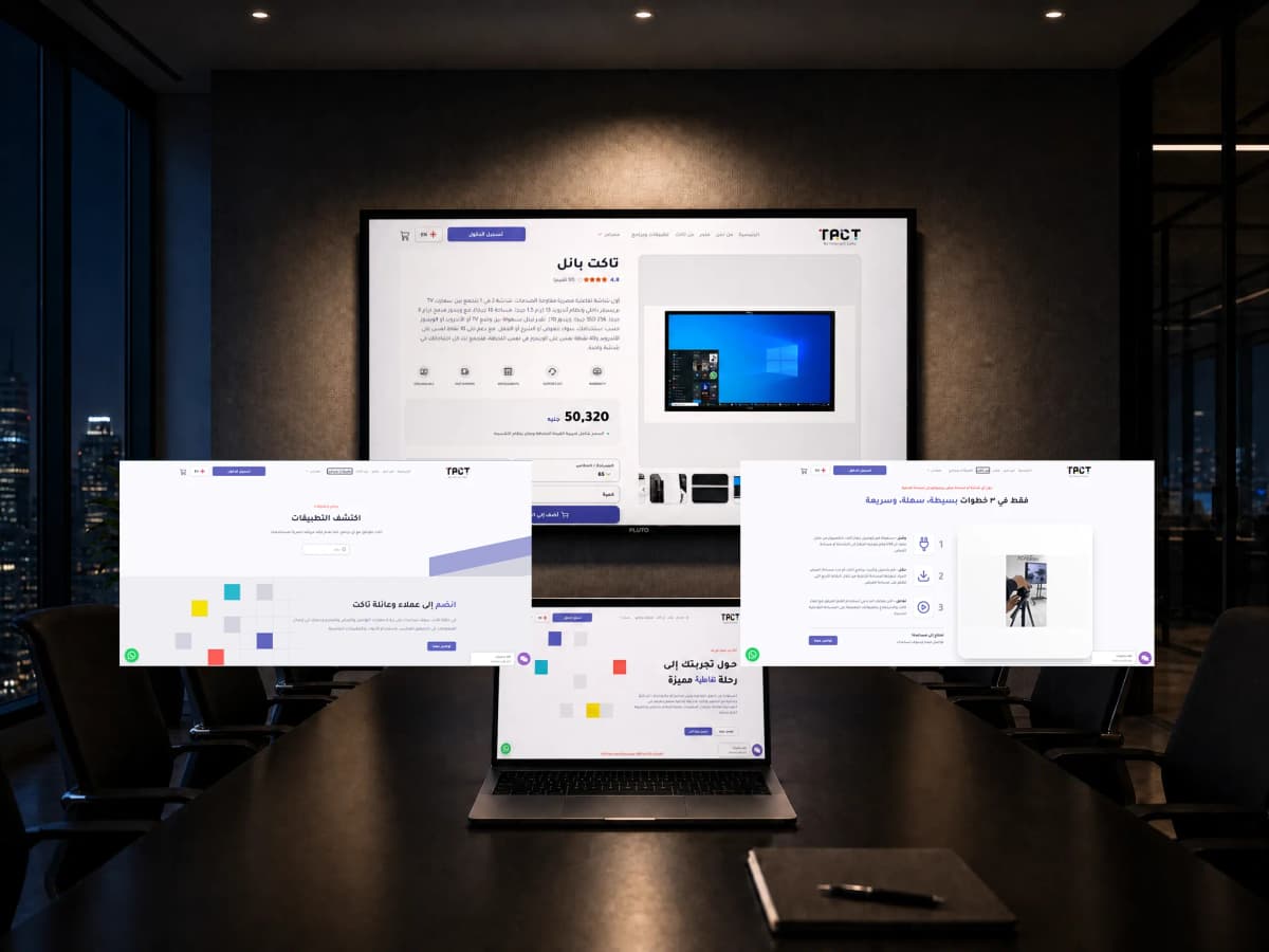
The marketing site. The home page that introduces the category, the long explanation on the About TACT page, the company page, the awards and company-profile pages, a careers page that accepts applications, and contact. This is the part that talks to somebody who does not yet know the product.

The store, product pages for the TACT device and the TACT Panel, with a price, a basket, a user account and sign-in. The purchase completes on the site rather than through a quote request sent by email.

The software platform. A download page carrying three builds: TACT for Windows, TACT for macOS from 10.11, and TACT for Linux from Ubuntu 14. Each build shows its file, its version number and its update date. Beside it sits the marketplace listing the applications that run on the device.

Content and dashboard. An article library across both versions, with the client managing products, releases and articles themselves, each record type in its own shape.
02·From the build

Three audiences, and the third route was lifted off the path

The easiest mistake on a site like this is to treat every visitor as a prospective buyer. It breaks the experience for more than one of them at once.

A new visitor arrives with one question: what does this thing do? They will not read a specification, and they will not wait through a marketing paragraph to reach the point. So the first screen shows the device working, and immediately after it three steps (connect, download, interact) and they understand.

A buyer arrives with a different question: why is this not just an interactive whiteboard? So the comparison was put on the page itself in six points: a longer service life than interactive screens that wear out with use, an interactive surface up to 150 inches, compatibility with any projector and any application on the machine, a price saving over 50% with a warranty and instalments, customer service, and up to four people interacting at once.

And somebody who already bought arrives with a third question unrelated to either: where is the latest build? Walking that person through selling copy wastes their time and irritates them. So they got two independent entries in the main navigation (the marketplace and the software download) that reach their goal in one click.

03·From the build

Why the moving demonstration comes before any word

The most consequential design decision here was a decision to withhold: exactly one thing on the page moves.

The product is visually difficult. A small device doing a large thing, and no still photograph carries that idea. So the home page opens on a moving demonstration of a hand writing on an ordinary surface. It answers the first question without a word, and spares the visitor a paragraph they were probably not going to read.

For that demonstration to work, the rest of the page has to be quiet. The visual language was built calm: a primary blue, curved shapes separating sections instead of rules, and a great deal of empty space. When one thing moves, the eye goes to it. When two things move, the visitor watches neither.

The same logic governed the writing. The feature cards are in the language of benefit rather than specification: up to 150 inches rather than a surface figure, four people at once rather than a technical term, works with any application rather than a compatibility table. The person reading is a head teacher or a procurement officer, not an engineer, and they need a sentence they can make a decision on.

04·From the build

Arabic is the original; English is a complete version

The product is presented as the first Arab-African device of its kind, so the Arabic version is not a translation. It is the original. But distributors and markets abroad need a complete English version rather than a translated menu.

So two genuine versions were built, each with its own complete article library, and every page on the site having its counterpart on its own URL. The two declare each other through hreflang with an x-default, so Google serves whichever version fits the searcher instead of treating the pair as duplicates.

And so it stays workable over time rather than becoming a burden, language was made part of the content record itself in the dashboard. The client enters a product once and writes its other-language version on the same screen. They do not open an English site and start the work again.

05·From the build

Small details that carry weight

There are small decisions here that do not show in a screenshot but change how the site is used.

The version number and its date sit next to every download. A school IT department will not install a file whose version it cannot see, and showing that number removes an entire phone call.

The device is sold with instalments and a warranty, and that is written into the comparison itself rather than buried in a terms page, because for a school assembling a budget, it is sometimes the thing that closes the decision.

The careers page accepts real applications. A company that manufactures a device and hires for it reads differently from a company reselling an import, and that is part of the positioning rather than an administrative extra.

And the article library was built one layer before the product's name: not TACT, but interactive classrooms, what interactive whiteboards cost, presentation tools. That is the only place this product can be found, because nobody is yet searching for it by name.

The phases

How the work ran

The question: what is the buyer comparing against?

The core question: what is the buyer comparing this against? The answer was an interactive whiteboard, and the whole site was built around that comparison.

Positioning

Framing the explanation as three steps, and deciding that the demonstration precedes any written copy.

Information architecture

Separating the three routes (explanation, store, software and marketplace) in the main navigation.

Design

A calm visual system with a single moving element, and feature cards written as benefits.

Build

Next.js, a store with accounts and a basket, and a release system for three operating systems.

Content

Writing both versions in full, and building the library one layer before the product's name.

Launch and a review of the purchase route

Launch, indexing watched across both versions, and the purchase route reviewed.

Handover

What became yours

  • Domain, hosting and source files in the client's name from day one
  • A control panel the content is edited from without a developer
  • A walkthrough for whoever takes the site over afterwards
  • A month of monitoring and fixes after launch

Outcome

The outcome

The site became the whole digital layer around the product. It introduces the device to somebody hearing of it for the first time, shows it working before describing it, puts the comparison against an interactive whiteboard in front of a buyer while they are still building a budget, sells through a store with accounts and a basket, and after the sale it remains the software and app channel for everybody holding the device.

All three routes run in two complete languages, every page with its own counterpart and URL, the two declared to each other so a searcher in Egypt and a searcher abroad each land on their own version.

The short version: a product whose category has no name, and a site asked to do three contradictory jobs for three different audiences. It was solved with one sequence (introduce, compare, sell) by lifting the third audience out of that path entirely, and with a data model that carries products, software releases and articles as independent objects inside one system. The result works before the sale and after it, and the client runs it themselves from a dashboard.

Delivery figures

  • 4

    systems running inside one another as a single product

    The published site

  • 3

    operating systems with a build, a version and a date on show

    The published software page

  • 2

    complete languages, not a translated menu

    Counted in the published sitemap, 6 September 2026

  • 3

    setup steps that close the largest objection: connect, download, interact

    The published home page

Work like this starts with a call about where you actually are

If this is close to what you need, the Web development page carries the whole method: what you receive, and the number the work answers to.

Our clients

Companies that chose to work with us

Some of our clients, across sectors with nothing in common.

  • Bravo Agrochemicals
  • El Masrya Office Furniture
  • Tareek El Shifa Center
  • Dr Ghada Yousry
  • Interact Labs
  • rawa
  • Next Industry
  • Medixia.ai
  • Falcon Water Treatment Systems
  • Golden Blast
  • Happy Plastics
  • Smart Modern School
  • Rafiq Academy
  • IPS Sports Academy
  • Mo Valley
  • Hyalure
  • G-Tour
  • Préime
  • Rahal
  • Dausar
  • El Gamry